
“Graphic Design is My Passion: Particle Accelerator Edition”
Imagine you’re in a thrift store. You spot a book with a title like The Babel Matrix, a name that screams “existential sci-fi thriller” or maybe “Neo-Gnostic time loop conspiracy”. Intrigued, you flip it over—only to find the front cover looks like the result of feeding a kaleidoscope LSD and locking it in a blender.
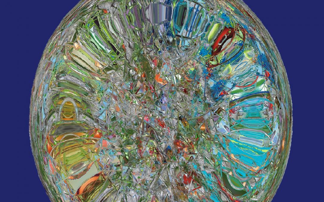
Let’s begin with the centerpiece: a sphere composed of jagged, refracted chaos. It’s unclear whether this orb is made of stained glass, melted credit cards, or a thousand bad NFT designs compressed into a single horrifying JPEG. It’s the visual equivalent of someone saying, “I don’t know what AI art is, but I’m gonna wing it.”
Then there’s the background: just a flat, soul-crushing wall of navy blue. It’s the kind of color you’d find on a failing corporate intranet homepage from 2003. You could practically hear the Windows XP startup sound as you stare at it too long.
Now, about the typography. The title font is somewhere between “medieval carnival ride” and “freeware wizard RPG,” which would be fine—if this were about a cursed jester in the 12th century. But paired with the fractal bomb of a central image? It’s like yelling Shakespeare over dubstep.
And the author’s name? Just floating there at the bottom, in a stretched-out sans serif that looks like it’s trying really hard to read as “futuristic” but ends up whispering, “default setting.” Not to mention that it appears to have been aligned using the “eyeball it and hope for the best” method.
Genre-wise, we’re completely adrift. Is it metaphysical science fiction? A speculative crystal healing manual? A coloring book for sentient AI? This cover tells us nothing—except that there was absolutely no designer in the room with the author.
Ultimately, The Babel Matrix is a visual Rorschach test: it tells you more about your own tolerance for clutter and pain than it does about what’s inside the book. And if this cover were a matrix? You’d be begging for the blue pill.