
When Helvetica Met Existentialism: Notes to a Little Bird
There are book covers that whisper. There are those that shout. And then there’s Notes to a Little Bird, which awkwardly mumbles while holding a megaphone the wrong way.
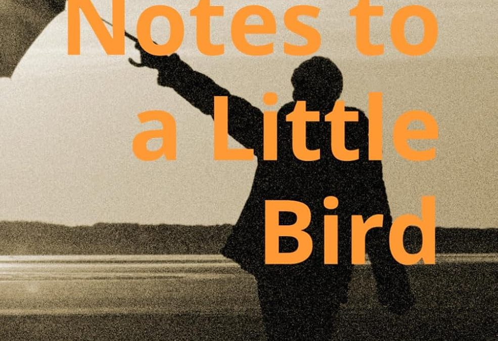
At first glance, you might assume this is a low-budget indie film poster from the early 2000s, probably French, probably involving three hours of metaphor about sand. But no—this is a real nonfiction book about reclaiming civil society. Allegedly.
Let’s start with the image: a silhouetted man reaches into the void holding… what exactly? A broken umbrella? A bird? The last shred of graphic design credibility? No one knows, and we’re not sure the designer does either. The sepia tone attempts vintage gravitas but ends up evoking the emotional weight of a fax machine manual.
Then there’s the typography, which is aggressively orange. Not “bold orange,” not “striking orange”—just orange. The title is plopped across the man’s body like a warning label. “Caution: May Contain Earnestness.” The author’s name is in all-caps at the top, just in case you forget who’s responsible for this digital ransom note of a design.
And let us not overlook the subtitle: “Reclaiming Civil Society,” typed out in bright cyan, presumably chosen to make sure every single color conflict is represented on one cover. It’s like someone said, “Let’s use every contrasting color combo from a third-grader’s poster board project—except worse.”
What’s truly magnificent is the total lack of hierarchy. It’s a word soup floating atop visual ambiguity. You don’t read this cover—you decode it like a Cold War cipher.
We assume this is a serious book. But the cover suggests it’s a deeply confused TED Talk trapped in a motivational poster’s body. A well-meaning one, sure. But it’s hard to trust a manifesto when it looks like it was designed in Microsoft Word during a layover.
Designers, take note: if your cover’s vibe is “Guy yells at cloud,” maybe go back to the drawing board. Or at least, open Canva.