Never Too Late… to Call a Graphic Designer
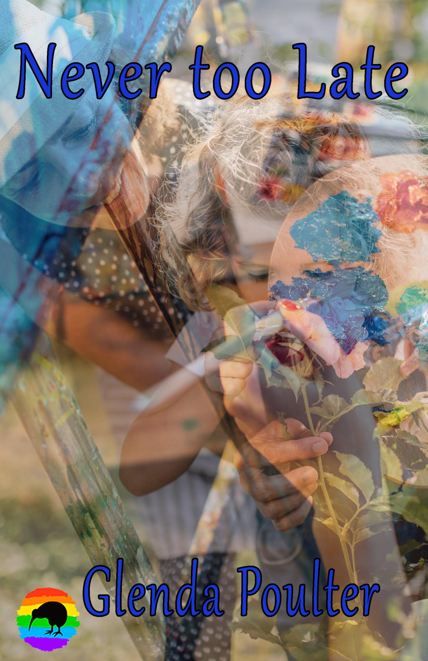
Ah, “Never Too Late” by Glenda Poulter—a cover so daring, so unapologetically chaotic, it almost loops back around to genius. Almost. This is the visual equivalent of someone opening too many tabs in their mind and then slapping them all into Photoshop on full transparency.
At first glance, it appears a small child is smelling a flower. But wait, is that another child? Or a hand? Or a rainbow? Or the ghost of a Jackson Pollock painting? It’s hard to say. The cover layers image upon image like a watercolor fever dream—with each photo gently suffocating the next under a wash of translucence and indecision.
The real villain here, however, is opacity abuse. Every element is see-through, as if afraid of commitment. “Don’t worry,” whispers one ghostly hand to another, “we’ll never be fully seen.” The result is a visual blender: a grandmother, a child, some flowers, paint strokes, and possibly a spiritual awakening, all mixed into a 2D smoothie.
And just when your brain has given up parsing the collage, you spot it: the font. That blue serif with a black shadow proudly proclaims Never too Late like a motivational email header from 1999. It’s legible… sort of. At least more than the image underneath it.
Then there’s the crowning moment: the rainbow-colored kiwi in the bottom corner. What does it mean? Is this a New Zealand book? A pride memoir? An avian side plot? It feels like a sticker added in Microsoft Word 2003 for good luck.
What this cover lacks in clarity, it tries to make up for in everything else. Artistic vision? Check. Sentimental photography? Check. Unintentional abstract horror? Also check.
This isn’t a book cover. It’s a group project where everyone got to contribute but no one had veto power.

