
What happens when your book promises adorable monkeys, art theft, and mysterious devices—yet looks like the dust jacket of a noir funeral pamphlet? You get Saving Maria, a cover that’s somehow both hilariously off-base and profoundly committed to its own confusion.
Let’s break this monochrome mess down:
The top line sells us an oddball adventure:
“A stolen art collection, a mysterious device, and three adorable monkeys…”
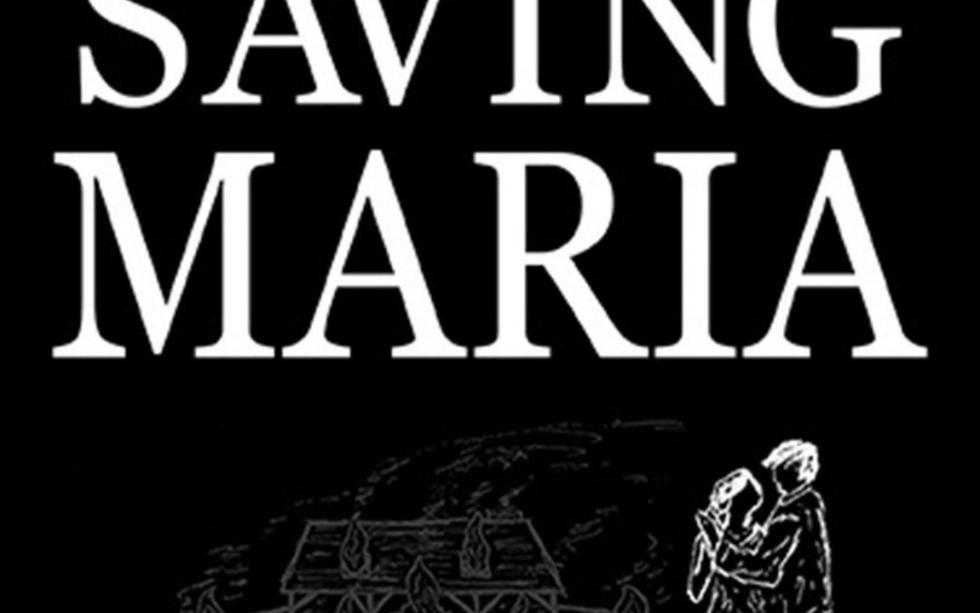
…which raises the immediate question: Where are the monkeys? The only creature here is a ghostly couple ballroom dancing in front of a house that’s very much on fire. Are the monkeys inside? Did they set the fire? Are they watching from the bushes, judging us?
The design is all business and no sense. The black background is stark and depressing, like the opening credits of a mid-budget legal drama. The serif typeface screams old-school seriousness, while the sad white line drawing at the bottom could be a rejected courtroom sketch. It’s hard to tell if this is romance, satire, or a tragic accident printed on a T-shirt.
But the real kicker? A glowing review from Midwest Book Review calling it “a mercurial page-turner.” It’s sitting on this cover like a dog-eared footnote to chaos, trying valiantly to assure us that yes, this is a real book. It’s like putting a Michelin star sticker on a vending machine burrito.
In the end, Saving Maria isn’t just a misfire—it’s a tragic comedy of design errors, genre identity crises, and conceptual abandon. If it were a movie, it’d be the kind where someone tries to tango through a disaster zone with a chimp on their shoulder and no clear exit strategy.