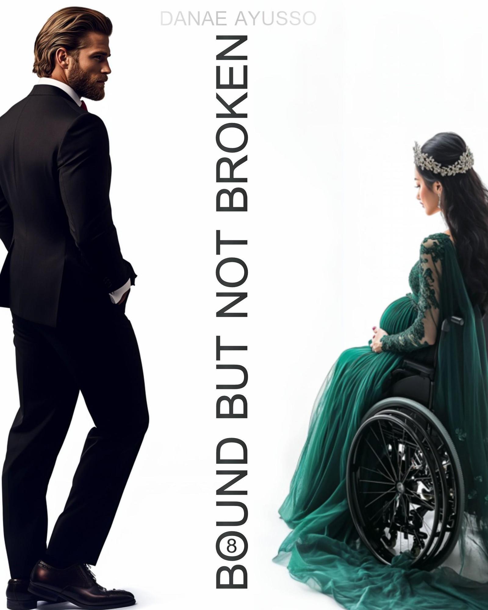
But Definitely Bent Out of Shape
When you first glance at Bound But Not Broken by Danae Ayusso, you might think: “Hey, this is polished!”—and you wouldn’t be completely wrong. The cover wants to be a bold statement piece. It wants to scream “emotional depth,” “complex characters,” and “wheelchair user but make it glam.” And yet… somehow, it ends up quietly whimpering “Help me, I’ve been trapped inside a minimalist Canva template for three days.”
Let’s break this down.
We’ve got our brooding man in a tailored suit, beard sharp enough to slice existential doubt. He’s staring pensively across a glaring white void at a gorgeously dressed, tiara-wearing pregnant woman in a wheelchair. This setup has soap opera energy—but make it inspirational. So far, so extra.
But then. Then you notice the vertical title slapped between them like a typo in Helvetica Bold. “Bound But Not Broken” is printed sideways down the middle like the designer fell asleep mid-layout and leaned on the keyboard. And just in case the theme wasn’t painfully on the nose already, the “O” in “BOUND” is replaced with the international wheelchair accessibility symbol, reminding us this cover is absolutely about disability… just in case you missed the woman in the wheelchair and the word “bound.”
The contrast is so stark it becomes disjointed. The visual tension between the minimalist approach and the melodramatic posing leaves you unsure if you’re supposed to feel inspired or just slightly embarrassed for everyone involved. It’s like someone said, “Give me The Bachelor, but also The Fault in Our Stars… and can we make the typography unreadable for fun?”
Here’s the thing: it could have worked. The intent was strong. The models are striking. The symbolism is there. But somewhere between the bold concept and the final export, it got lost in its own white space.
Final diagnosis?
Not broken, maybe, but certainly in need of structural editing.

