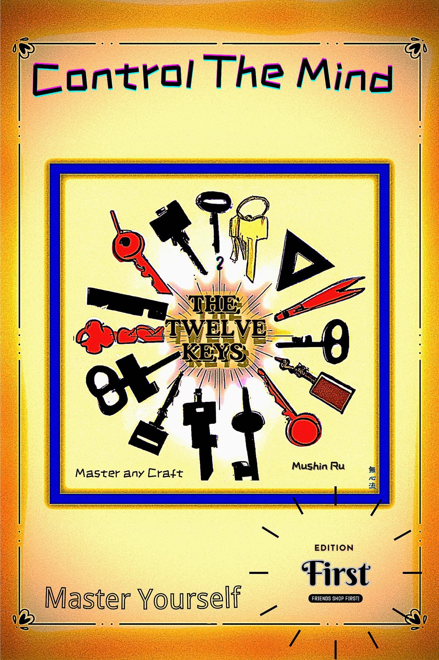
If you’ve ever wondered what happens when a motivational seminar, a clip art library, and a 1990s flyer template walk into a bar… this cover is your answer.
The Twelve Keys sounds like a profound, life-changing manifesto, but the cover looks like the result of an all-nighter fueled by instant coffee and free graphic design software. At the center, a chaotic halo of mismatched keys — some real, some suspiciously resembling bottle openers or torture devices — radiate around the title like they’re part of a low-budget game show prize wheel.
The fonts? An unholy alliance between ransom note whimsy and WordArt nostalgia, blissfully unaware of visual cohesion. The “Edition First” stamp in the corner gives big “mail-order catalog” vibes, and the sunset gradient border looks like it’s trying to sell you either enlightenment or a timeshare in Florida.
And then there’s the tagline, Control The Mind — which is printed so boldly and prominently at the top that it’s easily mistaken for the book’s actual title. It’s a classic case of visual hierarchy gone rogue, leaving the true title (The Twelve Keys) demoted to a supporting role in its own cover.
If the author’s goal was to make readers question their grasp on reality before even opening the book, well… mission accomplished. Somewhere in this cover are the keys to self-mastery — but you’ll have to unlock the mystery of the design first.

