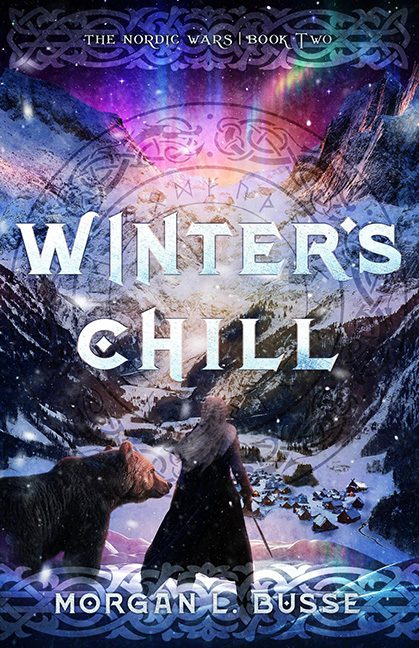
Ah, Winter’s Chill. A title that suggests quiet snowfall, frostbitten drama, and maybe a few hearty mugs of mead. Instead, the cover delivers a mash-up that looks like the rejected poster for a Game of Thrones spinoff called Bears, Braids, and Bad Filters.
The scene: a solitary figure with flowing hair stares dramatically over a wintry valley, sword in hand, as if contemplating the deep philosophical meaning of snow. Beside her, a bear stands… not menacingly, not protectively, but like it wandered into the shot because someone left a trail of salmon. The village below is lit like a holiday postcard, because apparently the Viking apocalypse includes twinkle lights.
But the real star of the show is the color palette. The Northern Lights are on overdrive, the mountains are glowing like they’ve been hosed down in purple Gatorade, and there’s a faint Celtic knot overlay, because Norse themes weren’t confusing enough without throwing in something you’d find etched into a novelty Guinness glass.
The typography? “Winter’s” features an oddly enthusiastic snow texture, while “Chill” suffers from the dreaded “design by WordArt” effect. All of it floats above a background so busy that the letters are practically screaming to be freed from their frosty prison.
In short: Winter’s Chill delivers the kind of visual chaos that suggests your fantasy epic may come with a side of motion sickness.
