Welcome, dear readers, to tonight’s feature in Horrible Covers After Dark — a sultry stroll through the land of high drama, questionable font choices, and the kind of graphic design that makes you wonder if the designer was paid in Hot Topic store credit.
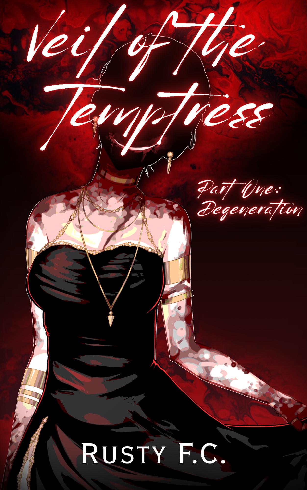
“Veil of the Temptress” sounds like the kind of title you’d expect on a forbidden romance novel dripping with sin, silk, and maybe one tasteful dagger. What we got instead is a murder scene at the lipstick aisle of Sephora. Our temptress stands in all her glory — which is to say, neck down only — as if the artist decided facial expressions were too much work and just filed her head under “miscellaneous void.”
She’s drenched in enough gold chain jewelry to single-handedly collapse the global economy if pawned, while her skin is… patchy? Mottled? Is it a supernatural curse or did the illustrator just forget to toggle off the “marble countertop” texture layer? It’s body horror meets fashion editorial, and not in a good way.
The background is a roiling red miasma of murder, molten lava, and possibly a red velvet cake batter spill. It’s unclear whether we’re supposed to feel aroused, afraid, or just slightly hungry.
The title itself, scrawled in blood-glow script, is so jagged it could cut your corneas. And because no bad design choice ever stands alone, the subtitle Part One: Degeneration sits in the exact same illegible style, like the world’s edgiest optometry test.
Finally, the author’s name, “Rusty F.C.”, is dropped in a completely unrelated serif font at the bottom — the visual equivalent of wearing Crocs to a masquerade ball.
Verdict: This cover is what happens when your goth cousin takes up graphic design the same week they discover anime. Sultry? Maybe. Tempting? Only if you like your romance with a side of retinal strain.

