
Oh, August of 68’ — a title that promises drama, nostalgia, and maybe even a hint of historical gravitas… and then immediately sucker-punches you with a design choice that screams, “I made this in Microsoft Paint at 3 a.m.”
Let’s start with the apostrophe in 68’. That’s not the kind of apostrophe you use for abbreviated years — that’s the kind you’d find in “John’s sandwiches.” Which is fitting, because this cover has about the same sophistication as a deli menu printed on an office inkjet.
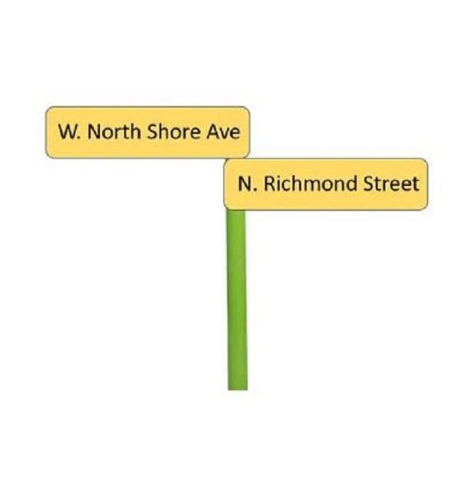
The focal point — if you can call it that — is a lonely green pole holding two road signs: W. North Shore Ave and N. Richmond Street. Floating there. On a blank white void. No context, no scene, no attempt to convey an era, mood, or meaning. It’s just there, like an awkward wedding guest you’re not sure who invited.
And then, there’s the font choice. For the title and author name, we’re getting some kind of half-hearted, faux-historical typeface that makes you think “pirate map” or “Renaissance Fair,” which is exactly not what your floating street sign stock image was suggesting. It’s a genre mismatch so sharp you could cut yourself on it.
The whole composition feels like someone Googled “minimalist book cover” and completely missed the point that minimalism requires intentional design — not just the absence of effort.
If this cover were a movie trailer, it would be two minutes of silence followed by a shot of a stop sign, then the credits.