
Ah, Temple Knight — or as I like to call it: “What if Medieval Times had a sunset cruise line?”
This cover is a fever dream of every fantasy cliché rolled into one Photoshop disaster. Let’s break it down:
-
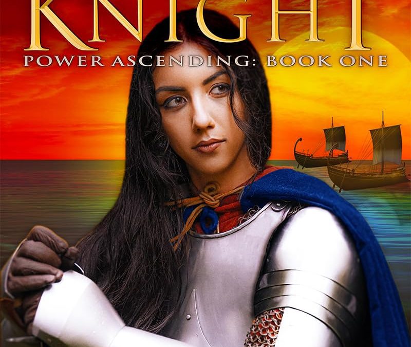
The Knight: Our heroine is wearing armor so shiny it looks like it came fresh out of the Target Halloween aisle. She’s holding a helmet, but her expression is less “I’m ready for battle” and more “does this breastplate make my shoulders look wide?”
-
The Sunset: Behold the sky — not just any sunset, but an overcooked microwave pizza of orange and red. It’s so intense it looks like the sun itself filed for workers’ comp after working overtime on stock photo sites.
-
The Ships: Oh yes, the majestic ships in the background. Except… they’re Viking longboats pasted into the scene like clip art from “Windows 95 Fantasy Bundle.” Why are Vikings photobombing a knight’s solo glamour shot? Because accuracy is for cowards.
-
Typography Choices: The title font is the obligatory fantasy golden serif — the kind that screams, “I couldn’t afford a graphic designer, but I could afford the ‘Lord of the Rings’ font from Dafont.” The tagline “Fantasy and Action” feels like it was generated by shaking a Magic 8 Ball: “What’s this book about?” → Fantasy. Action. Boom.
-
Overall Vibe: This is less “epic fantasy saga” and more “cosplayer trapped at a renaissance fair who agreed to a photo shoot at sunset before the turkey legs ran out.”
If book covers were movies, this one would be airing on SyFy right between “Sharknado 8” and “Viking Vampire Cheerleaders.”