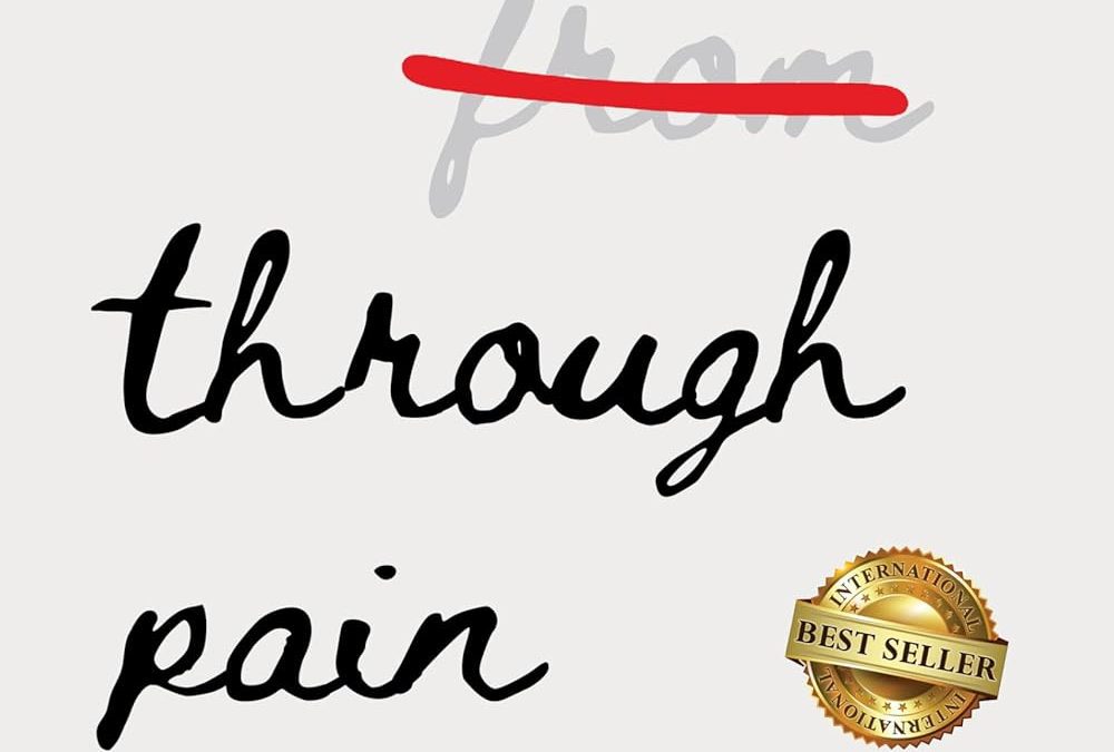

Ah, yes. The minimalist self-help cover that whispers, “I didn’t pay a designer, I just spiritually aligned myself with Microsoft Word.”
Let’s start with the bold artistic choice: striking out the word “from.” This is not just graphic design — it’s graphic passive-aggression. Imagine buying a book only to have its title corrected like a middle school essay. It’s as if the author is yelling: “NO, YOU DON’T HEAL FROM PAIN, YOU HEAL THROUGH PAIN. GET IT RIGHT, SUSAN.”
The typography? Oh, it’s giving major “found in the free fonts folder and called it destiny” vibes. Somewhere, a font designer is quietly weeping, knowing their casual cursive has been repurposed for faux-Zen suffering.
And then, of course, the pièce de résistance: the International Best Seller badge. Nothing says “credible spiritual guide” like a giant pixelated gold sticker slapped on the cover like a clearance tag from Walmart. It’s as if the book wants to heal you through pain while also giving you a migraine from trying to look at it.
The subtitle tries valiantly — “A Journey Through Suffering Toward Inner Peace” — but when paired with this design, it reads more like: “A journey through Canva templates toward graphic disappointment.”
Final verdict: this cover is not healing anything. It’s the visual equivalent of stepping on a LEGO barefoot — yes, you grow from it, but only because you had to.