
Ah, Justice’s Journal. The book cover that asks the eternal question: What if Nancy Drew fell into a Photoshop time machine and crash-landed in a low-budget Lifetime crime drama?
Let’s break this down:
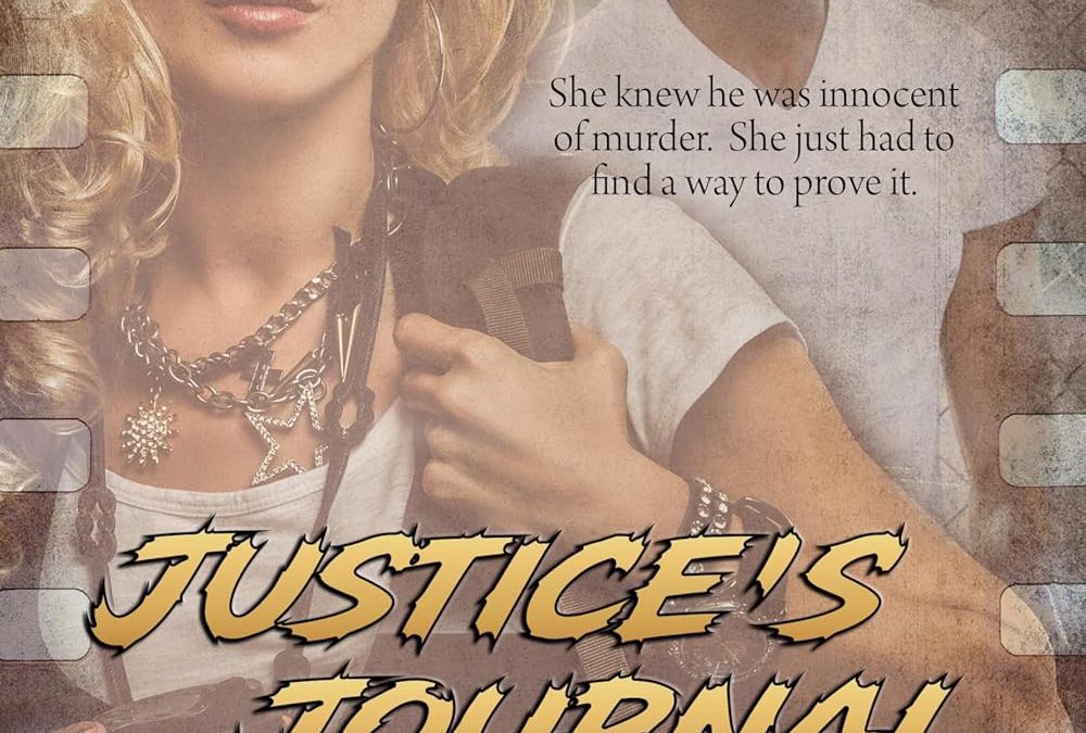
The Film Strip Border:
Nothing screams “professional thriller” like a clip-art film reel pasted awkwardly along the sides. It doesn’t frame the art, it doesn’t enhance the vibe, it just sits there like a decorative throw pillow someone left in a gas station.
The Title Font:
“Justice’s Journal” is rendered in a jagged yellow font that looks like it was stolen from the opening credits of American Gladiators. Because nothing says serious legal thriller like ‘90s extreme sports graphics.
The Subtitle:
You almost missed it, didn’t you? That tiny, apologetic “a thriller” crouching underneath the title like a dog who knows it’s about to be blamed for peeing on the carpet. If your genre tag is ashamed of itself, maybe rethink your branding.
The Imagery:
Our blonde heroine, styled as if she just left an Abercrombie photoshoot, holds a coffee cup and stares directly into the reader’s soul. She is serving “Instagram influencer cosplaying as attorney.”
Behind her, a man stares out with the thousand-yard stare of someone realizing his entire acting career has been reduced to “brooding murder suspect on bad book cover.”
Together, this dynamic duo is supposed to say “justice and determination.” Instead, it says “promo flyer for an unfinished student film called Coffee and Crime.”
The Mood:
The whole thing has been dunked in a muddy sepia wash that screams, “We discovered the grunge filter in PicMonkey and just went for it.”
Final Verdict
This isn’t Justice’s Journal, it’s Photoshop’s Misfire. If justice truly had a journal, the first entry would be:
“Day One: Why does my cover look like the DVD you find in the bargain bin at Dollar General?”