
If you’ve ever wondered what it would look like if a western novel cover were designed by a rodeo clown with access to Microsoft Paint and a shaky sense of symbolism, look no further. Justice Rides is here to giddy-up right into your nightmares.
The first thing that punches you in the eyes is the title font — distressed, bold, loud — like it was left in the desert sun until it crumbled. Nothing says “justice” like letters that look like they’ve been gnawed on by a pack of coyotes.
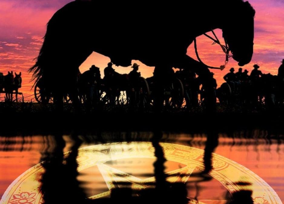
Then we’ve got our central cowboy silhouette, stoically riding into a sunset so aggressively purple-orange it could be mistaken for a Lisa Frank folder if you squint. Behind him, a shadow army of wagons and riders lurk like the world’s least intimidating gang. Instead of menace, they give off the energy of extras waiting to be told “action.”
But the pièce de résistance, the true sheriff of this design disaster, is the GIANT sheriff’s badge reflected in the water. This thing is so oversized it looks like a magic portal to a Wild West water park. The poor horse looks moments away from tumbling headfirst into a glowy manhole cover from Cowboy Tron.
And then there’s the name. SaddleTramp1956. Folks, this isn’t an author name. This is what your uncle uses as his AOL screen name when he joins a trucker forum. Slap a @hotmail.com on the end and you’re emailing the man directly.
This isn’t a book cover. This is a surrealist western fever dream where symbolism went feral, fonts revolted, and the sunset demanded equal billing. Justice Rides? Maybe. But not before tripping over its own badge-shaped reflection.