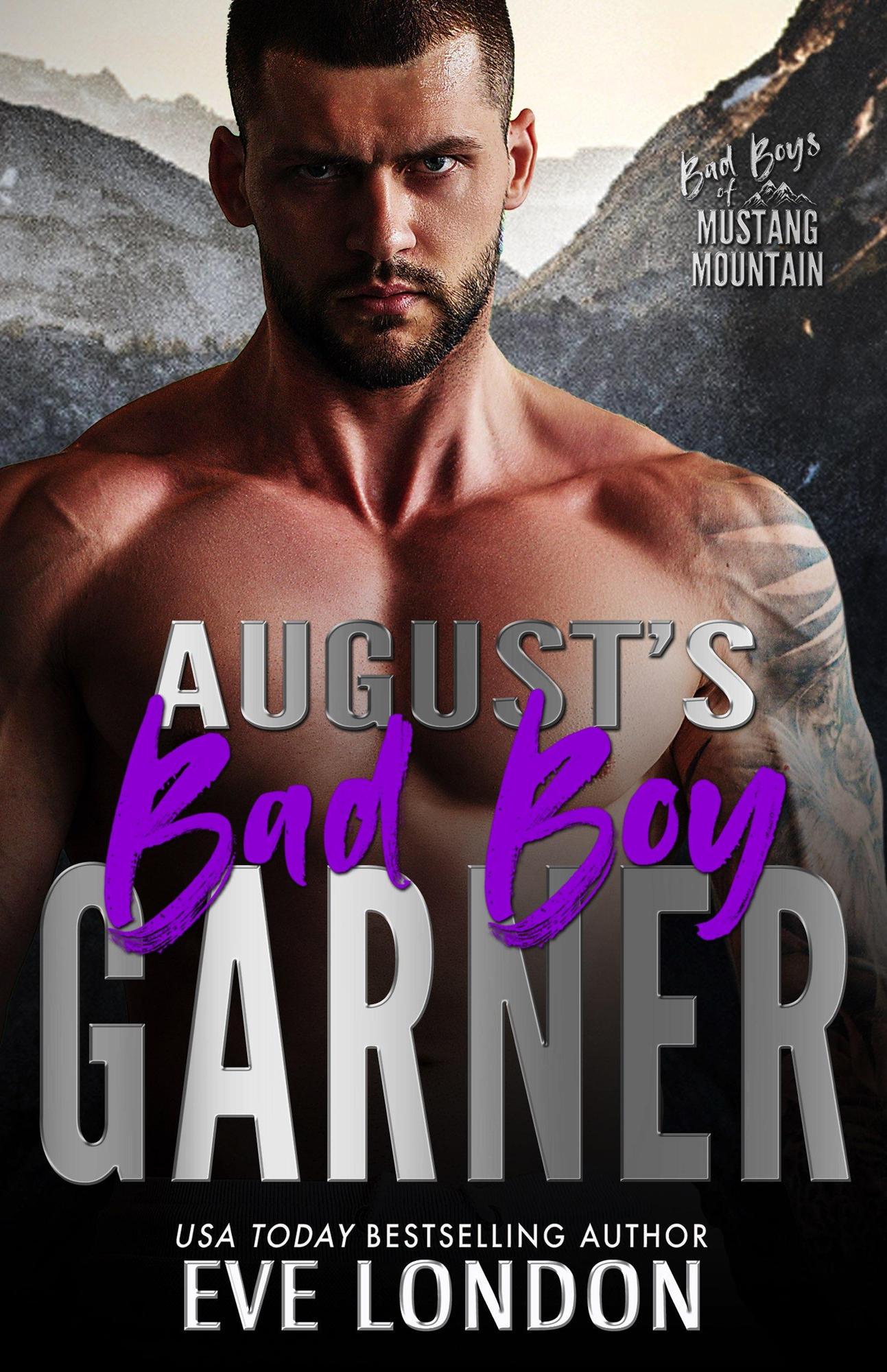
Somewhere deep in the halls of Romancelandia, a designer whispered: “What if we just put a shirtless dude glaring at the reader and called it a day?” And thus, August’s Bad Boy Garner was born.
This cover is the spiritual equivalent of someone shouting, “Look at my abs!” across a Walmart parking lot at 2 a.m. Let’s break down this oily, glowering masterpiece of misfires:
- The Model: Our titular “bad boy” looks less like a smoldering heartbreaker and more like he just lost his gym towel and is about to ask you if you’ve seen it. His glare is intense, but not in a sexy rebel way—more in a constipated gladiator way.
- Typography Woes: “Bad Boy” is scrawled in electric purple like someone let a teenager loose with Microsoft Paint’s highlighter tool. Then it’s slammed on top of bold metallic block letters, which scream, “I belong on a Monster Truck ad, not a romance novel.”
- The Background: Mustang Mountain looms dramatically behind him… but the image is so grainy it feels like it was ripped from a 2002 GeoCities travel blog. The man doesn’t belong in front of those mountains; he belongs on a detergent commercial set where he scowls until his white tank top is stain-free.
- Series Branding: Bad Boys of Mustang Mountain. I cannot emphasize this enough: this sounds like a CMT reality show about delinquent bull riders, canceled after one drunken fistfight in the pilot.
This isn’t a book cover. This is a Photoshop crime scene where abs, Sharpie fonts, and copy-paste mountains collided in a way no reader deserved.

