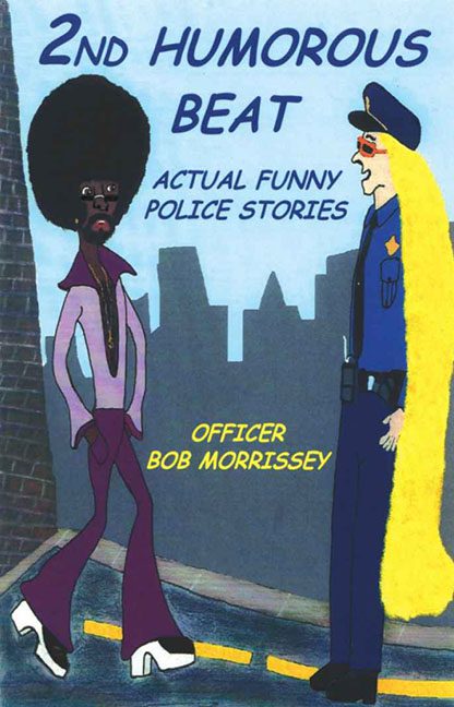
There are covers that make you laugh with them, and then there are covers that make you laugh at them. 2nd Humorous Beat: Actual Funny Police Stories by Officer Bob Morrissey confidently parks itself in the second category — a surreal, pastel fever dream where humor goes to be questioned, not found.
Let’s start with the characters, because honestly, where else could we? On the left, we have a man so drenched in purple polyester that you can practically hear the wah-wah pedal. His afro defies physics, his chest hair has its own zip code, and his bell-bottoms could serve as emergency parachutes. He looks like he just strutted off the set of Shaft, only to realize he’s wandered into a D.A.R.E. poster drawn by someone who’s never seen another human being.
Facing him on the right is an officer who appears to be half cop, half fairy-tale character. That hair — a golden waterfall cascading down to the pavement — looks like Rapunzel joined the force but refused to follow grooming regulations. It’s the kind of yellow that’s so bright you can almost hear it humming. The officer’s sunglasses, perched defiantly on the world’s longest face, complete the look of a police procedural as interpreted by an after-school art club.
Behind them, the “city” skyline looms like a jagged row of gray gravestones — perhaps for the concept of perspective. The street curves awkwardly beneath their feet, a warped ribbon of mustard yellow that refuses to obey geometry. There’s no light source, no sense of space, and definitely no sign of artistic restraint. Every visual element seems to have been cut and pasted from a completely different universe.
Now let’s talk typography. The title, 2ND HUMOROUS BEAT, is scrawled in navy blue like it was painted freehand during a coffee break. The word “HUMOROUS” leans just enough to suggest mild dizziness. Below it, ACTUAL FUNNY POLICE STORIES tries desperately to reassure you that, yes, humor exists somewhere inside this madness. Then at the bottom, OFFICER BOB MORRISSEY is proudly typed in bright yellow, as if it’s glowing with the confidence that the rest of the design sorely lacks.
Color choices? Picture a Crayola box that’s been left out in the sun too long. Every hue clashes, every surface feels chalky, and yet somehow the whole thing radiates the chaotic optimism of a design student discovering markers for the first time.
What really seals the deal, though, is how unintentionally perfect this cover is for its title. “Humorous beat”? Mission accomplished. Not because the stories inside promise laughs — but because the cover itself is the comedy. This isn’t graphic design; it’s visual stand-up. The punchline just happens to be everything you’re looking at.
In a world where police-themed books try to project grit, realism, and authority, this one gives us Saturday morning cartoon energy and says, “Yeah, we’re going there.” It’s part Dragnet, part Disco Inferno, and part Why did you draw this?
In the end, 2nd Humorous Beat achieves the impossible: it’s both a crime and a confession, sketched out in colored pencil and unapologetically earnest. It’s a cover that doesn’t need a siren — it’s already the loudest thing in the room.
