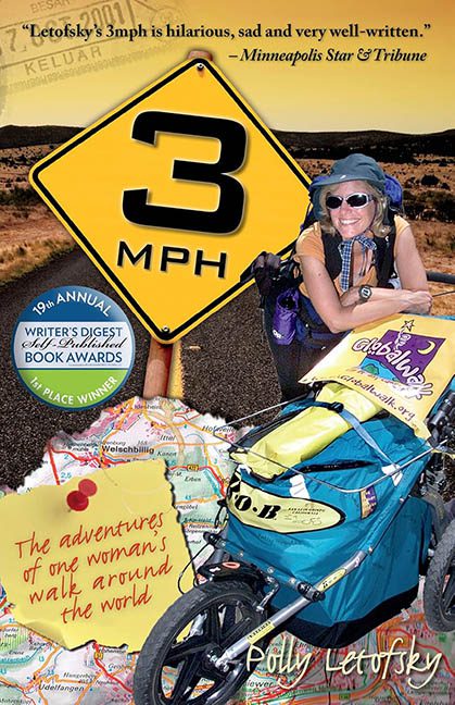
Strap on your sneakers and tighten that fanny pack, folks—because we’re taking a scenic walk through the design equivalent of a roadside souvenir stand explosion. Today’s cover catastrophe is 3 MPH by Polly Letofsky, a title that proudly proclaims the speed at which both the author and, apparently, the graphic design choices were moving.
Let’s start with the most obvious question: what on earth is happening here? This cover is less a cohesive design and more a fever dream of travel clip art hurled onto the page in the dark. We’ve got a massive yellow traffic sign screaming “3 MPH” like it’s warning readers of a design slow zone, a jogging stroller that seems to be rolling straight out of ClipartLand, and a very enthusiastic Polly beaming next to a map that appears to have been ripped from a Rand McNally atlas and run through a kindergarten glue stick project.
The Photoshop work here deserves its own passport stamp for “Crimes Against Composition.” Nothing matches—not the shadows, not the lighting, and certainly not the resolution. Polly’s legs mysteriously disappear into the map like she’s being absorbed by Google Earth, and the jogging stroller casts more shadows on our souls than it does on the road. There are jagged cut-out edges, awkward transparency halos, and a layering strategy best described as “random order of panic.”
Then there’s the typography, which bravely goes where no typographer should. We’ve got hand-drawn script in white for the author name, marker-red handwriting for the subtitle, and military-grade bold sans serif for the title—each one apparently unaware the others exist. The end result? A visual shouting match where no one wins, least of all the reader.
To add one final badge to this sash of design disaster, there’s not one but two award seals slapped on like gold stars from a very confused teacher. And don’t think we missed the newspaper pull quote jammed into the sky like a blimp nobody asked for.
3 MPH may refer to the speed of Polly’s walk around the world—but it also might be the speed at which this cover was thrown together. One thing’s for sure: no one stopped to check for traffic violations along the design highway.
In summary: buckle up, because this cover is a full-on crash course in what not to do when designing for print.
