
Our suggested rework

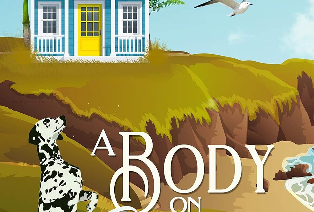
At first glance, this cover screams “stock clip art on autopilot.” While the intention is clearly to land somewhere in the cozy mystery genre, the execution ends up feeling less charming and more like a PowerPoint slide gone rogue.
Illustration & Style
The digital art style lacks cohesion or depth. Each element—the Dalmatian, the overly bright beach house, the jagged cliff—is rendered in a different visual tone, giving the whole scene a patchwork, flat quality. The seagull in flight feels copy-pasted from a separate reality. There’s no lighting or shadow to tie the scene together, which makes the setting feel both artificial and directionless.
Typography Trainwreck
The type hierarchy is baffling. The oversized “B” in “Body” colliding with the rest of the title feels more like a layout bug than a stylistic choice. It’s hard to say whether it’s supposed to be elegant or quirky—either way, it fails to achieve either. The subtitle’s serif font stuffed into a ribbon at the bottom adds yet another competing style to an already overcrowded composition.
Color Confusion
We’ve got a neon yellow door, bright turquoise siding, bold white text, grassy greens, and deep browns all mashed together without a unifying palette. It’s not vibrant—it’s chaotic. The lack of tonal harmony makes it visually loud and uninviting rather than warm and intriguing.
Visual Focus Issues
What’s the focal point here? The dog? The cliff? The house? The title? Everything is fighting for attention, leaving the viewer unsure where to look. For a mystery novel—especially a cozy one—you want clarity, mood, and intrigue. This gives none.
Verdict:
This cover may have been designed to appear quaint or whimsical, but it instead delivers a disjointed, overworked, under-curated visual mess. A more minimalist approach with a tighter art direction and genre-specific clarity could have saved it. But as it stands, this belongs exactly where you’ve placed it—in the Horrible Book Covers gallery.
Why our rework works:
1. Typography Hierarchy
- The title uses a refined serif font that fits the cozy mystery genre beautifully-elegant yet approachable.
- The author name is bold and commanding without being overpowering-great for a bestselling author.
- The series info at the bottom is clean and clearly readable, which is important for readers browsing a series.
2. Visual Cohesion
- The color palette of golden tones and soft sky hues captures a warm, inviting setting—classic cozy mystery vibes.
- The placement of the Dalmatian and cottage are thematic and much better integrated into the environment compared to the original’s flat composition.
3. Scene Balance
- Foreground elements like the grasses and rocks give depth to the setting.
- There’s a clear sense of place and mood—a peaceful seaside with an undercurrent of mystery (thanks to the lone dog and the slight atmospheric haze).