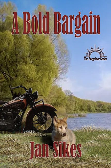
When you name your book A Bold Bargain, I don’t think anyone expected the bargain to be with the gods of graphic design — and let’s just say, they shortchanged you.
Front and center, we have what appears to be a wolf pup… or maybe a plush toy… or maybe a taxidermy project gone wrong. Whatever it is, it’s far too small, looks suspiciously detached from reality, and has the same vibe as a sticker someone forgot to peel off a child’s notebook. Floating there in front of the grass, it’s begging to be noticed — but not for the right reasons.
Behind it, there’s a motorcycle, stoically parked by a lake. Except, is it parked? Is it levitating? Is it in a completely different universe of lighting than everything else around it? Hard to say. It’s the kind of Photoshop placement where shadows go to die, leaving us with a motorbike that looks like it’s pondering its own existence.
And then there’s the title. Ah yes, the title. Set in a font that’s screaming “1990s Microsoft Word default.” It’s bold, sure, but in the same way your uncle’s clip art-heavy PowerPoint presentation was bold — bold enough to hurt your eyes.
Let’s not ignore the cherry on top: the series logo. It’s as if someone realized at the very last second, “Wait! It’s part of a series!” and slapped it on wherever there was space. The result? A logo that looks like it got lost on its way to an elementary school flyer.
Altogether, this cover isn’t a bargain — it’s an overstock clearance sale at the design disaster outlet.
