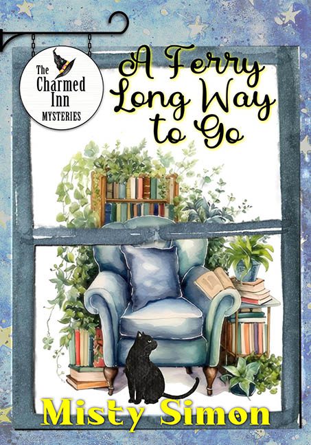
Sometimes a cover tells you exactly what you’re in for — in this case, it’s a long and bumpy ride down the river of cut-and-paste design, with no ferry in sight and a whole lot of visual turbulence. A Ferry Long Way to Go is meant to be a cozy mystery, but this cover looks more like a collage assignment from the last day of sixth grade art class.
Let’s start with the composition: we’re peering through a window that appears to be made of watercolor popsicle sticks, overlooking a living room scene that may or may not exist in this dimension. The chair — or what I assume is a chair — is trying very hard to be cozy, but its proportions scream “sentient marshmallow.” Balanced precariously on its arm is a book so malformed it could be mistaken for a badly folded quesadilla. Is it casting a shadow? Is anything? Not on this cover.
And then there’s the cat. Oh, the cat. Floating like a sticker someone peeled off a Lisa Frank folder, it sits in front of the chair without casting a single shadow. Is it really there, or is it just haunting the scene like a feline cryptid? We may never know.
Plants grow around the books like they’ve been watered with radioactive fertilizer, and none of the elements — not one — seems to belong to the same reality. The books are one style, the plants another, the chair a third, and the cat a fourth. It’s not whimsical — it’s a design hostage situation.
The outer frame? Blue. Starry. Possibly magical. Definitely slapped on like it came from a preschool astronomy unit. Hanging sign? Flat and mismatched. Title font? Teetering between “cutesy innkeeper” and “DIY Etsy fail.” There is no ferry. There is no destination. There is only a long way to go to design coherence.
In short, this cover is an overgrown greenhouse of genre confusion, where every element competes for your attention and none of them win. Cozy? Maybe. Professional? Absolutely not.
If you’re hoping to curl up with a good book, just don’t judge this one by its cover — it might be harboring more mysteries than the plot itself.
