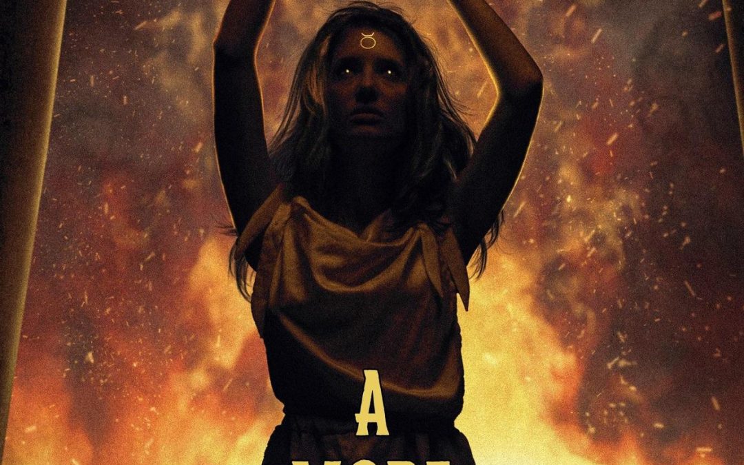

Ah yes, behold A More Ancient Evil, a book cover that manages to look like it’s been through at least three layers of Photoshop and one hasty cell phone snapshot before it got uploaded. And the pièce de résistance? The top two-thirds of the image forms a suspicious trapezoid, as if the author took a perfectly good piece of cover art, laid it on a kitchen table, snapped a photo at an angle, and said, “Yeah, this looks professional.” Nothing screams “ancient evil” like the telltale geometry of a rushed Kinko’s print job.
The fiery backdrop is trying so hard to be ominous that it’s practically shouting “I am fire! I am death!” — but the lighting on the central figure says, “I am actually in a dimly lit hotel ballroom.” She’s standing between two columns, raising her arms in either a dark summoning ritual or just trying to get the Wi-Fi signal to work. The mysterious glowing forehead symbol is there to tell you This Is Definitely Serious Occult Business™, but with the warm lighting and pose, it feels equally plausible that she’s about to belt out the opening note to an ‘80s power ballad.
The title font goes for the vintage, all-caps gravitas of an old pulp horror poster — but paired with the rest of this trapezoidal fever dream, it just feels like an awkward museum label on a blurry exhibit photo. And the “A Machete & Quill Horror” tagline is working overtime to sound gritty and literary at the same time, which is like trying to sell a haunted house as “also great for artisanal brunch.”
Overall: It’s not just a more ancient evil — it’s a more ancient image capture method.