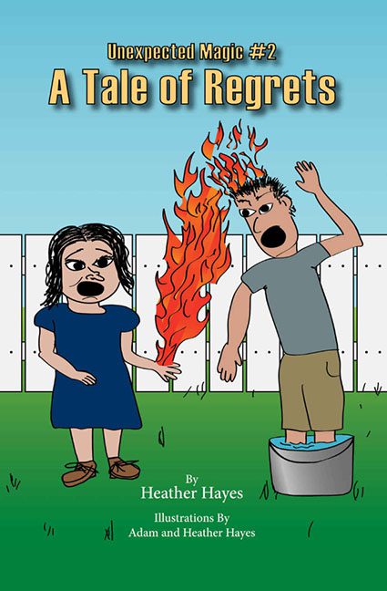
If there were ever a book cover that perfectly embodied its own title, it’s A Tale of Regrets. One look at this thing, and you immediately understand what regret feels like on a spiritual level. It’s as if the cover artist whispered to their software, “Make it look like trauma,” and the software enthusiastically complied.
Front and center, we’re greeted by two characters who seem to have been pulled straight from the uncanny valley of Clip Art Land. The woman stands expressionless, arm outstretched, while the man—whose head is engulfed in flames—is frozen mid-yelp, half-dunked in a bucket of water like he’s starring in a very strange public safety announcement. It’s supposed to be “unexpected magic,” but it looks more like “unexpected lawsuit.”
Let’s talk anatomy. The limbs bend in directions that suggest none of these people have ever seen a human before, much less drawn one. The woman’s hair resembles wet seaweed clinging to her skull, and the man’s proportions could make a scarecrow blush. His fiery agony, meanwhile, is captured with the emotional depth of a Saturday morning cartoon that didn’t get renewed after its pilot episode.
And those flames — oh, those flames. They’re less “magical energy” and more “PowerPoint transition effect gone rogue.” Each lick of fire looks hand-drawn in MS Paint with a mouse and a sense of vengeance. It’s as if someone thought, “You know what this cover needs? A visual metaphor for every bad design choice imaginable.”
The setting doesn’t help. Behind the chaos is a perfectly flat white fence that stretches into the distance like an existential void. The grass below is a single slab of eye-searing green, and the sky above is just one shade of blue, like someone used the “fill” tool and called it a day. There’s no depth, no atmosphere — just the artistic equivalent of a polite shrug.
Typography time. The title “A Tale of Regrets” is rendered in yellow with a chunky drop shadow that gives it the unfortunate vibe of a 1990s computer lab poster. “Unexpected Magic #2” sits awkwardly above it, in a font that looks like it wandered in from an entirely different genre — maybe “early webcomic about time-traveling accountants.” It’s as though every text element is competing for the title of “Most Misplaced.”
And let’s not overlook the composition itself — or rather, the lack of it. The characters are squished awkwardly toward the bottom third of the image, leaving an ocean of empty sky above them. The whole thing feels less like a fantasy story and more like an ironic PSA about the dangers of combining home haircuts and candlelight.
Even the title placement gives off big “we tried” energy. The text hovers in the middle, neither embracing the chaos below nor anchoring the space above. It’s just… there, much like our flaming protagonist’s will to live.
If this cover were a spell, it would be one of those that backfires immediately — with smoke, confusion, and someone yelling, “Wait, that wasn’t supposed to happen!” A Tale of Regrets promises magic but delivers madness — the kind that leaves you staring, slack-jawed, wondering whether the real enchantment is how it ever got printed.
In the end, the only magic trick here is how this design managed to make both fire and water look equally lifeless. It’s not fantasy. It’s not humor. It’s not even coherent. It’s a visual cry for help — one that ensures this Tale of Regrets will live up to its name long after the flames die out.
