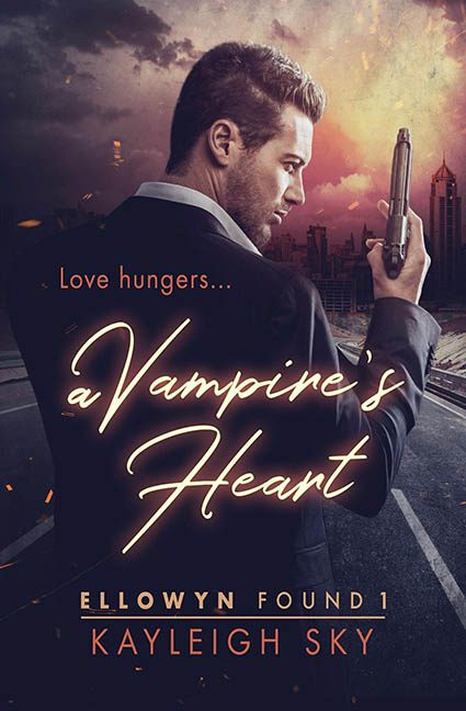
Somewhere in a dark alley between James Bond and Twilight, this cover stumbled out of the shadows, dropped its genre card, picked up a handgun, and said, “Close enough.”
Welcome to A Vampire’s Heart — where love hungers… and design logic goes completely unfed.
Let’s start with our hero: brooding, armed, and possibly on his way to crash the set of Taken 4. He’s got the look of a man who’s either avenging his lover or forgot to pick up garlic at the store. But wait — this isn’t a gritty spy thriller. No, dear reader, this is a paranormal romance, and we know that because the title is lovingly scrawled across the smoldering cityscape in a flimsy script font that screams “Pinterest wedding mood board,” not “immortal bloodlust.”
It’s giving us GQ meets Buffy fanfiction energy — and not in the good way.
Now, the tagline:
“Love hungers…”
…which is possibly the most legally required vampire-romance slogan in existence. Just once, we’d love a paranormal cover to step out of the cliché buffet and say “Love orders takeout.” But no — love hungers, and so do we… for better font pairing.
The background is a mishmash of exploding city ruins, embers floating like fireflies of confusion, and a lighting scheme that doesn’t even pretend to match the subject. Our vampire’s head is lit from the left. The city’s on fire from the right. The romance is somewhere in the middle, sobbing into a trench coat.
And the color grading? Oh, it’s murky mauve meets action-flick orange — a visual casserole that says, “I found the saturation slider and got nervous halfway through.”
Typography crimes abound. The title’s in cursive, the author’s name is in a bold serif, and the series title has been forced into a graphic jail cell made of two thin orange lines. The fonts are not friends. In fact, they might be actively plotting against each other.
Let’s not ignore the genre betrayal here.
This is a vampire book — supposedly — but where’s the fantasy? The bite? The… fangs? Instead, we get a corporate hitman on a freeway overpass, looking like he’s just been ghosted by Anne Rice.
Final thoughts?
This isn’t a Vampire’s Heart.
It’s a Graphic Designer’s Ulcer, lovingly wrapped in stock photography and wishful thinking.
The only thing undead about this cover is the reanimated corpse of three clashing genres, duct-taped together with cursive font and Photoshopped sparks.
Love may hunger…
But this design?
It just bit off way more than it could chew.
