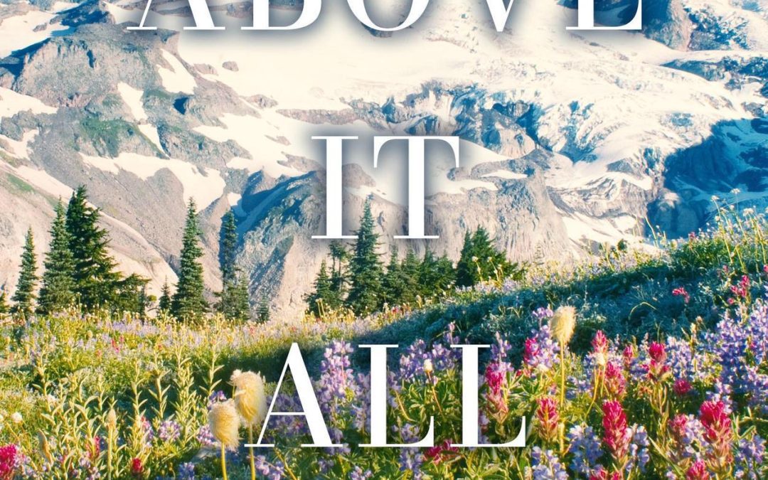

Proof that mountains can be majestic… and still photobombed by bad typography.
Ladies and gentlemen, gather ‘round for today’s installment of “Why Did This Happen to Design?” — a little number I like to call Above It All.
Here’s the setup: you’ve got a sweeping, jaw-dropping photograph of a mountain that could sell calendars at Costco. A field of wildflowers so gorgeous it makes you want to put on a wide-brimmed hat and start a nature vlog. Snow-capped peaks that practically whisper “serenity.” And what do we do with this visual masterpiece? That’s right — we slap white text on it like we’re labeling our vacation pics in Microsoft Paint, circa 2003.
The title floats dead center with zero integration, like it’s afraid to commit to any part of the scenery. It’s giving “PowerPoint slide in the boardroom when no one’s looked at the template.” The kerning is fine, but that’s like saying “the parachute works” when you’re already in a nosediving plane.
And can we talk about the font choice? The typeface screams “romance novel” while the background screams “National Geographic,” resulting in a visual custody battle where no one’s happy. The mountain didn’t ask to be part of this. The flowers didn’t audition. They’re just here, silently judging the whole situation.
This is the kind of cover that makes me wonder if someone had a bet to see how little design effort it would take to get something published. Honestly, if you’re going to go minimalist, at least own it. Instead, we have the tragic middle ground: a glorious photo wearing a dollar-store “Book Cover” Halloween costume.
Design Takeaway: Nature is free. Fonts are cheap. But making them work together? That’s a skill — and this cover is a cautionary tale about what happens when you skip that part.