Ah yes, Advocatus — the book cover equivalent of a fog machine left running in a broom closet during a low-budget fantasy cosplay shoot. If you’ve ever wondered what happens when a 3D rendering, a lens flare, and an unfortunate font choice all get locked in a dark room together and panic, this is your answer.
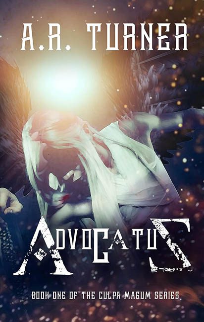
Let’s start with the main image, which appears to be some sort of goblin/angel/undead elf hybrid mid-swoon, collapsing into a cloud of glowing dust while a lightbulb explodes directly behind its skull. The character’s face is lit from above like it’s being interrogated by the sun, which results in deep shadows, glowing features, and the general look of “Oops, I forgot to turn off bloom lighting in Unreal Engine.” The rendering is muddy, the pose is confusing, and the whole figure looks like it was freeze-framed mid-dramatic death spiral in a forgotten PS2 game cutscene.
And then there’s the background, or as I like to call it, the Sparkle Abyss. Floating particles, magical dust motes, and vague smoky nonsense fill every inch of the scene like someone spilled the “Mystical Fantasy Overlay Pack” across the canvas and just went with it. There is zero spatial coherence. Everything floats, everything glows, and nothing makes sense. It’s as if the visual storytelling tripped over itself, rolled down a hill, and face-planted into a particle effect.
But none of that holds a candle to the typography, which is a crime spree all its own. The author’s name, “A.R. TURNER,” is done in a stiff, industrial sci-fi stencil font that has no business on a fantasy cover. It’s rigid, mechanical, and about as magical as an airport barcode.
Now gaze in horror at the title: ADVOCATUS — a word mangled by fonts so jagged, inconsistent, and performatively gritty, you’d think each letter was designed by a different dystopian street artist. The “A” is aggressively stylized like it’s posing for a vintage battle mech logo, the “V” looks surgically removed from a tech company pitch deck, and that final “S”? It’s barely clinging to the same alphabet. To add insult to injury, we get the subtitle “Book One of the Culpa Magum Series” hiding at the bottom in a font so tiny and irrelevant-looking it could be mistaken for a watermark.
The entire composition suffers from what we in the design world call “Too Much Going Nowhere.” No contrast, no focal point, and no stylistic unity. The light is too bright, the figure is too dark, and the text looks like it was assembled by someone throwing stencils at a wall during a thunderstorm.
In the end, Advocatus is a cautionary tale of what happens when you try to look epic without asking whether anything actually fits. The fonts scream, the visuals blur, and the goblin-angel-elf-demon hybrid in the center? Probably still waiting for someone to turn off the spotlight.
