Ah yes, another thrilling entry in the Katie & Maverick Cozy Mysteries, where the mystery isn’t so much whodunnit as it is “who approved this cover?”
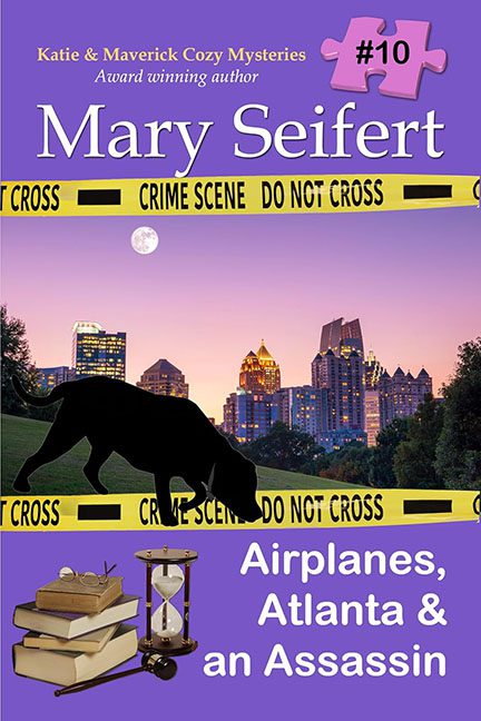
Let’s start with what hits you immediately: the “design” is essentially a PowerPoint slide that went rogue. The layout divides the space into two awkward chunks—top and bottom—separated by a horizon line that’s less a transition and more a digital rupture in the space-time continuum. Above, we’ve got a twilight skyline of Atlanta looking like it was yanked from a royalty-free image site on dial-up speed. Below, a field lit in broad daylight, apparently immune to the concept of cohesive lighting.
Then, front and center, a black dog silhouette with one of the strangest back legs you’ll ever see in canine anatomy. Is it walking? Lunging? Mid-yoga pose? The silhouette itself appears to be a rushed vector graphic, slapped on without even the courtesy of a shadow or ground interaction. It floats above the crime scene tape like a confused goth balloon animal.
Oh yes, the crime scene tape—because nothing says “murder mystery” like stock yellow ribbons arched across the page like they’re holding the entire design hostage. Why create atmosphere when you can just label it?
And then there’s the font buffet. The title alone uses at least three fonts, one of which may have escaped from a high school graduation program. The author’s name is in a formal serif font, the subtitle is in something bold and basic, the puzzle piece in the top corner shouts “#10” in a completely different font again, and of course the series name gets a dainty little italic to really round out the typographic identity crisis.
Speaking of that puzzle piece—what is going on there? It’s a giant pink jigsaw chunk in the corner with “#10” floating like an afterthought from a scrapbooking convention. Was it supposed to be charming? Instead, it looks like a children’s toy wandered into a murder scene.
But wait—there’s more! In the bottom corner we’re treated to a tidy pile of floating clip-art: books, an hourglass, and a magnifying glass. None of which are interacting with each other or the scene, as if they’ve just dropped in from a different project file entirely. It’s not a vignette—it’s a lost and found.
Everything about this cover screams “assembled in Microsoft Paint during a 15-minute lunch break,” from the lack of depth to the mismatched lighting to the lazy paste-job of stock assets. There’s no visual hierarchy, no focal point, and certainly no excuse.
In conclusion, Airplanes, Atlanta & an Assassin is not a cover—it’s a design hostage situation wrapped in clip art and bound with fonts held against their will. It aspires to cozy mystery charm but lands squarely in “graphic design is my hobby” territory.
To paraphrase the crime scene tape: do not cross… into Photoshop without a plan.
