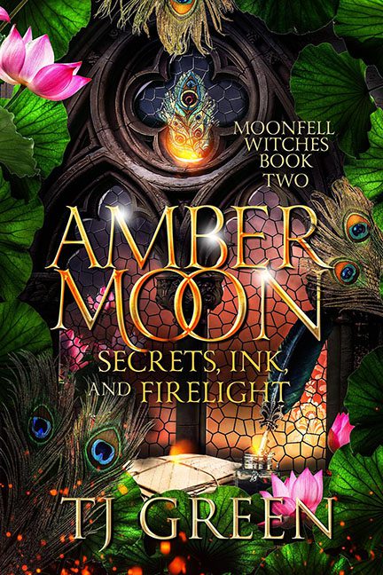
Some covers whisper magic, some hint at mystery, and some… just look like the entire inventory of a craft store sneezed all over a stock fantasy backdrop. Amber Moon: Secrets, Ink and Firelight falls firmly into the third category.
First, let’s address the peacock feather infestation. They’re everywhere — shoved into corners, poking out from the sides, crowding the title like overzealous parade float decorations. They don’t blend, they don’t symbolize anything (other than “look, shiny!”), and they certainly don’t belong in what’s supposed to be a witchy fantasy. Instead of enchantment, we get “Mardi Gras clearance aisle.”
Then we hit the typography disaster. The main title, AMBER MOON, comes in flashy gold with swirls and curls, as if trying to cosplay as Tolkien’s more dramatic cousin. But wait — someone decided the “OO” needed to overlap like Olympic rings. Because nothing says witchy mystery like typography that looks like it’s gunning for sponsorship from Coca-Cola. And just when your eyes are reeling from that, Secrets, Ink and Firelight comes barging in underneath in a completely different font, crammed on top of the chaos like a sticky note.
And the background? Oh, it’s there. Somewhere. Behind the peacocks, lotus flowers, leafy foliage, random glowing orbs, gothic windows, and a suspiciously staged table of witchy props. The problem is that none of these elements talk to each other. It’s not atmosphere, it’s hoarding. This isn’t a cover, it’s a Where’s Waldo? for people who shop at Michaels.
The overall effect is less “mystical fantasy” and more “fantasy thrift store explosion.” Everything is shiny, everything is loud, and everything is screaming for attention. Instead of feeling transported, the reader just feels overwhelmed — like they’ve been trapped inside the peacock feather section of Hobby Lobby.
Verdict: This cover isn’t magical, it’s maximalist. The peacock’s on the platter, folks, and it’s stuffed with every single design trope the artist could find.
