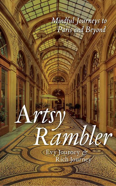
There’s minimalist design, and then there’s Artsy Rambler—a cover that says, “We had one photo and a dream… and stopped there.” This isn’t a book cover. It’s a vacation slideshow title slide wearing its Sunday best. It’s Paris, yes—but it’s Paris by way of PowerPoint 2007.
Let’s begin with the background image: a perfectly pleasant stock photo of a Parisian passageway, complete with intricate mosaic flooring and charming arched ceilings. But instead of elevating it, the design team—or more likely, the authors themselves—simply let it sit. No colour grading. No cropping for composition. No visual adjustments to make it feel like a cohesive piece of book art. Just a postcard with delusions of literary grandeur.
Then we get to the typography—and this is where the real tragedy unfolds. The title Artsy Rambler is set in a swooping, faux-literary script that tries very hard to be whimsical and elegant. Unfortunately, it ends up looking like the logo for an Etsy store that sells hand-painted wine glasses. It’s dropped clumsily across the middle of the floor like someone tripped while carrying a stack of wedding invitations.
Above it, the phrase “Mindful Journeys to Paris and Beyond” has been wedged awkwardly under the glass ceiling, forced into a spot where it’s almost—but not quite—legible. It’s in a smaller, more conservative serif font, which clashes with the flowy title below and feels like it’s trying to be taken seriously while standing on a decorative tile that says “Live, Laugh, Louvre.”
And the authors’ names? Barely visible. Down in the corner in a fine, understated serif font that whispers from the edge of the cover like they’re not quite sure they want to be associated with this design. There’s no balance, no hierarchy, no sense that anyone knew how to use the alignment tool in whatever design software was used—assuming software was involved at all.
Worse still, the cover gives no clear tone. Is this a travel memoir? A mindfulness guide? A meditative photo journal? The title says “whimsical vagabond.” The subtitle says “spiritual travelogue.” The image says “Google image search: Paris corridor.” None of it connects.
In the end, Artsy Rambler doesn’t just fail to be artistic—it fails to be a cover. It’s a visual shrug, a publishing placeholder, a design that rambled its way into existence without checking a single map or font pairing. This isn’t a mindful journey. It’s an aesthetic layover with no connecting flight.
