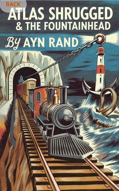
If Objectivism taught us that man must rise by the sweat of his brow, then this cover proves that someone was definitely sweating — just not over design principles.
This two-for-one special edition of Ayn Rand’s ideological doorstoppers looks less like a literary classic and more like a propaganda poster for a Soviet train cult. It’s giving “industrial strength,” but not in the empowering, steel-and-smoke kind of way. More like, “Did you just stack two covers and dare them to make sense?”
Let’s unpack this steel-plated visual freight train.
Front and center we have a locomotive shooting out of a tunnel like it’s trying to flee the narrative. The perspective is so distorted, the train seems to be entering from the fourth dimension, angling directly off the tracks and possibly into your coffee table. Behind it, looming like a ghost of metaphors past, is a lighthouse—because what’s more on-brand for Rand than a phallic symbol literally guiding industry?
And what’s that up top? Why, it’s a gigantic anchor, crashing down from the heavens onto… what? Our ambitions? The American Dream? A misplaced lighthouse roof? It’s hard to tell. What’s clear is that gravity and symbolism are both very confused.
Then there’s the typography, which is a full-on identity crisis. “Ayn Rand” is presented in a polite blue cursive script that looks freshly borrowed from a Better Homes & Gardens feature on bundt cakes. Below it, the titles of Atlas Shrugged and The Fountainhead are in stern, all-caps industrial block letters—stacked like two corporate slogans shouting over each other in a steel mill breakroom.
The colors are bold, sure—reds, yellows, and concrete grays—but they’re battling for attention like rival ideologies in a college freshman’s dorm room. The whole layout has the pacing of a state-run roller coaster ride: thrilling, overdesigned, and somehow still confusing.
And let’s not ignore that the train is about to drive directly into The Fountainhead, metaphorically and maybe literally. A subtle nod to Rand’s literary collision course with her own philosophy? Probably not. More likely: someone merged two separate covers, hit “flatten layers,” and sent it to print without blinking.
There’s ambition here. There’s symbolism. There’s even effort. But there is no cohesion. This is a graphic design arm-wrestling match between 1950s ambition and industrial maximalism—and both sides lost.
In conclusion: This isn’t a cover. It’s a 20th-century identity crisis on cardstock.
Objectively speaking? The cover shrugged.
