Our suggestion

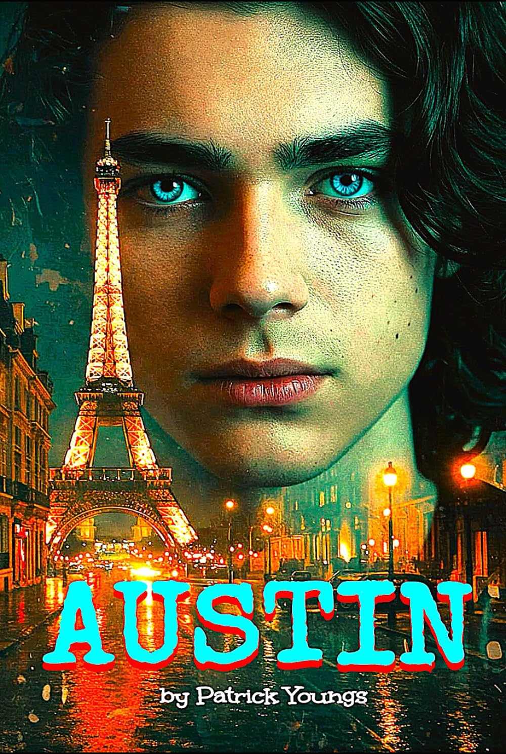
The cover for Austin is a study in visual contradictions and design misfires, beginning with a strikingly literal case of a “floating head.” The protagonist’s enormous face looms over the Eiffel Tower in the background—but instead of anchoring the composition, the perspective collapses entirely. The head is somehow behind the glowing tower but in front of the buildings that are clearly closer to the viewer, breaking both spatial logic and visual hierarchy. Rather than intrigue or mystery, it creates confusion.
The Eiffel Tower, normally a go-to icon for atmosphere or romance, is presented here in fiery orange against a neon-lit Paris street. Unfortunately, it reads more like a tourist postcard dipped in a vintage Instagram filter than the covert battleground suggested in the book’s synopsis. The atmosphere needed for a dark espionage thriller—shadowy, sleek, and suspenseful—is nowhere to be found.
Typography is another major obstacle. The title “AUSTIN” is rendered in a bold, playful, Western-style font with a cyan fill and harsh red shadowing, making it feel more carnival poster than international spy drama. It completely undermines the serious tone of a plot centered on a CIA-trained teen navigating a deadly cat-and-mouse game across Europe. The author’s name, “by Patrick Youngs,” is tucked below in a smaller font that feels like an afterthought—an aesthetic mismatch that further erodes any sense of professional polish.
Rather than conveying the high-stakes action and gritty realism described in the blurb, the overall visual language lands awkwardly between parody and pastiche. It’s an unfortunate mismatch of genre, tone, and execution—more chaotic than covert.
In summary, Austin may have the bones of a compelling espionage narrative, but the cover design doesn’t just miss the mark—it misses the genre altogether.
Here is our redo of the cover
What This Cover Does Well
1. Title Font (Ethnocentric):
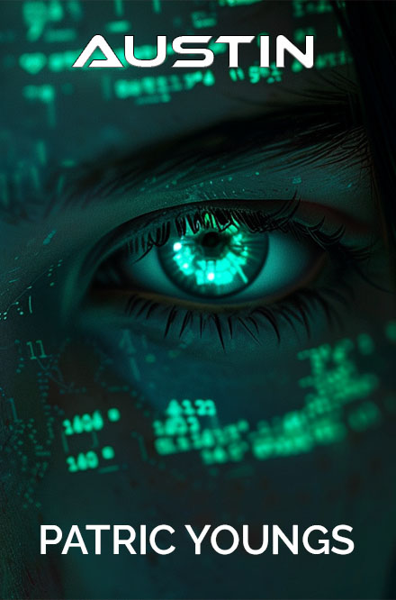
The choice of Ethnocentric for the title delivers immediate high-tech, espionage energy-perfectly fitting for a thriller involving covert ops, surveillance, and international stakes. Its angular, futuristic style cues readers that this isn’t a romance or literary memoir—this is sleek, modern intrigue.
2. Visual Focus on the Eye:
By zeroing in on a digitally enhanced eye, the design brilliantly captures the “Eyes of the Operative” concept you landed on. It hints at surveillance, artificial intelligence, or elite-level observation-elements that resonate with spycraft and intelligence thrillers.
3. Color Palette and Visual Data Overlay:
The glowing teal and neon green overlays evoke digital code, data analysis, and tech-driven environments. These hues are not only aesthetically modern, but also communicate genre instantly.
4. Author Name Placement and Font:
The clean sans-serif font for “Patric Youngs” (appears to be a form of Montserrat or Gotham Rounded) creates a nice contrast with the futuristic title. It’s professional, readable, and gives a polished feel.
The only suggestion to this is a tag line for the cover, which will only add to the reader draw.

