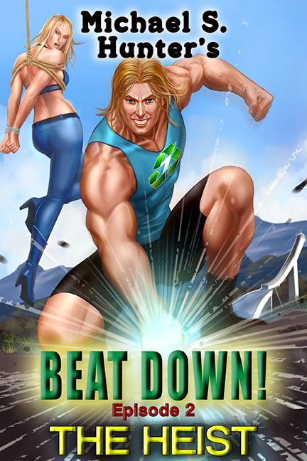
Every once in a while, a book cover comes along that doesn’t just whisper “bad design” — it flexes it. Beat Down! Episode 2: The Heist doesn’t merely enter the hall of fame for terrible covers — it punches its way in with a glowing, radioactive fist of graphic confusion.
Let’s start with the hero — or possibly the world’s angriest gym influencer. His anatomy defies every known biological rule. His deltoids are the size of small nations. His biceps look airbrushed with the same intensity as a mid-2000s energy drink commercial. If Michelangelo sculpted David after a five-hour protein binge and a caffeine crash, this would be the result.
And that expression — equal parts heroic, constipated, and deeply invested in his own forearm veins. You can practically hear him saying, “I didn’t skip bicep day, bro,” as he kneels over what appears to be a glowing pothole of radioactive regret.
Now, let’s not ignore the woman in the background. She’s suspended by a rope for reasons unclear, gazing over her shoulder as if realizing she took a wrong turn into someone else’s fantasy novel. Her jeans are polished to a chrome finish, and her hair cascades in that “rendered at 300% zoom in MS Paint” kind of way. She’s the damsel in distress, sure, but mostly she looks distressed about being in this art style.
The background is a fever dream of broken perspective — jagged mountains, warped roads, and light flares that scream, “I just discovered Photoshop layer effects and I’m not afraid to use them.” Everything glows, including the ground, the air, and probably the reader’s corneas after staring too long.
But no cover this confident in its chaos would be complete without typography crimes. “BEAT DOWN!” explodes in Hulk-green gradient glory, shadowed like it’s auditioning for a 1993 monster truck rally. Below it, “Episode 2” and “THE HEIST” fight for dominance like rival pro wrestlers, neither willing to take a step back. The fonts are all caps, all loud, and all desperate for validation.
And then there’s the recycling symbol on our hero’s chest. Subtle, right? Because nothing says The Heist like an environmental PSA emblazoned across a man built like an overinflated yoga ball. It’s unclear whether he’s saving the planet, smashing it, or just flexing at it, but one thing’s certain — this man recycles bad design choices.
Beat Down! is the perfect storm of overconfidence and under-editing. It’s not just a cover — it’s a time capsule from a parallel universe where every comic book artist was replaced by a malfunctioning AI trained on action figures and Axe body spray ads.
In short: Beat Down! doesn’t just break design rules. It bench-presses them, shouts “BRO!” at the moon, and then punches a glowing hole in the ground for good measure.
