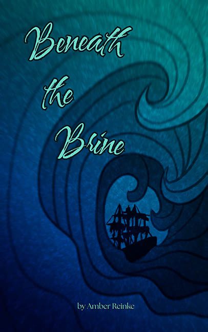
There are certain book covers that whisper their design crimes. Beneath the Brine opts for a full-blown foghorn blast.
Let’s dive straight in — much like this shipwreck of a design. The swirling ocean motif wants to feel like a tempestuous, stylized nod to nautical mythology, but instead looks like what happens when a coloring book page gets wet and warps. The swirling lines aren’t dynamic — they’re meandering. They don’t crash or churn. They sort of… wiggle. The wave doesn’t so much threaten the ship as it vaguely gestures toward it.
Ah yes, the ship. That poor silhouette is so timidly jammed into the whirlpool it looks like it’s trying to hide. It’s pure stock-shape energy — a black blob of rigging with no depth, no shading, and no context. It appears as though someone found a clipart file, slapped it down, and called it a night.
Now for the typography. A masterclass in “I did this in WordArt.” The title font is a curly, squiggly script that feels more like an awkward prom invitation than a maritime mystery. It clashes like barnacles on a velvet dress. Worse, it fades into the background in places — a sin against both accessibility and aesthetic decency. Even the layout is bizarre: the title sprawls in three unbalanced lines on the upper left while the author’s name — timid and afraid — sits near-invisible at the bottom in a muted gold that screams “forgot to change default color.”
Let’s also discuss hierarchy. Or rather, the absolute lack of it. What’s the focal point here? The ship? The wave? The illegible text? Trick question — it’s the background texture. That grainy, uneven ocean-blue backdrop pulls more focus than the title or artwork, and not in a good way. It gives off strong “accidental Photoshop filter” energy.
Visually, it’s a mystery — but not the good kind. It’s the kind where you can’t figure out what genre this is supposed to be. Literary fiction? YA fantasy? Historical naval drama? There’s no anchor here, and a book adrift in genre ambiguity is destined to sink.
Verdict: This cover is beneath the brine and beneath design standards. A lost opportunity drowning in a sea of confusion. The concept? Maybe salvageable. The execution? Sunk before launch.
May it rest in pieces next to the clipart schooner of sadness.
