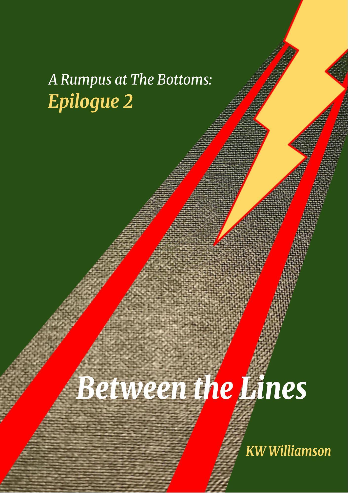
Sometimes a book cover whispers its theme with subtle elegance. Other times, it shouts at you with a lightning bolt, a chunk of carpet, and colors so mismatched you wonder if the designer was working with a broken monitor. Between the Lines falls squarely into the latter category.
Let’s start with the color palette: forest green, stop-sign red, and caution-sign yellow. This isn’t so much a harmonious scheme as it is a traffic accident. The harsh stripes and jagged lightning bolt collide with the tweed-textured gray band in a way that’s more “ugly sweater” than “book worth picking up.”
Then there’s the mystery of the imagery. Why is there a giant lightning bolt? Why is it slicing into a fabric runway like Zeus himself is targeting a couch? And what does any of this have to do with “A Rumpus at The Bottoms: Epilogue 2”? It’s as if the designer picked random shapes from a 1997 clip-art gallery and called it a day.
Typography? Oh, it’s here, but not in a way that helps. The subtitle Epilogue 2 pops in bold yellow, overshadowing the actual title. The main title, Between the Lines, is floating aimlessly across the tweed path, while the author’s name sits awkwardly in the corner like it’s embarrassed to be associated with the rest of the composition.
This cover doesn’t so much invite the reader into its world as it does warn them away with visual chaos. It’s a textbook example of how poor design choices can bury a book’s potential before anyone even opens the first page.

