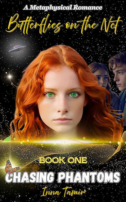
Some covers aim for cosmic mystery. Butterflies on the Net: Chasing Phantoms aimed for that too — and then got lost in a Photoshop wormhole full of sparkles, floating heads, and clip art butterflies.
The first thing that hits you is the floating redhead of destiny dominating the center. Her face glows like it was cut out of a shampoo commercial and pasted onto a starfield. And those eyes — neon green, so radioactive they could power a small city. Instead of ethereal beauty, we get “villain about to monologue her evil plan.”
Then the background starts piling on: a UFO cruising lazily in the corner, stars scattered like a Windows 98 screensaver, and two ghostly heads peering in from the right as if they accidentally wandered onto the set. They’re not mystical lovers — they’re paranormal photobombers.
The title fonts only deepen the chaos.
- Butterflies on the Net is written in a swirly yellow script that screams frozen yogurt shop logo.
- CHASING PHANTOMS is slapped in chunky white block text with a glow effect so fuzzy it looks like a WordArt setting from 1999.
- The author’s name and “Book One”? Yet another font, because why stop at three when you can roll the entire font roulette wheel?
And of course, we have the token butterfly in the lower corner. It’s supposed to be symbolic, but it feels like it was dropped in at the last second to justify the series title. A single monarch butterfly floating next to cosmic swirls and neon sparkles — this isn’t metaphysical romance, it’s stock image soup.
Let’s not forget the special effects overdose: glowing streaks, lens flares, golden dust, random blurry edges. It’s less “cosmic mystery” and more “Photoshop brushes: free demo pack.”
The verdict? Butterflies on the Net wanted to soar on cosmic wings, but the cover crashes headfirst into a chaotic design black hole. It’s not chasing phantoms — it’s chasing every bad graphic design impulse at once.
