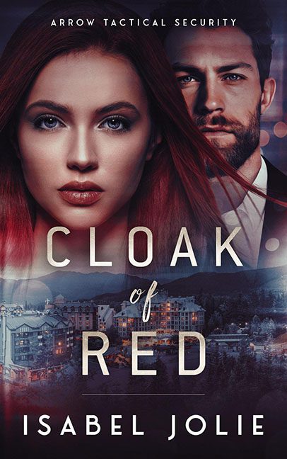
Ah yes, nothing whispers high-stakes romantic suspense like two mismatched stock models floating in a digital fog above a ski resort brochure. Welcome to the confusing visual cocktail that is Cloak of Red, where apparently, “Arrow Tactical Security” means squinting at over-smoothed cheekbones and wondering if the backup plan is selling condos in Aspen.
Let’s begin with the cover’s two primary suspects. Our red-haired heroine has clearly been airbrushed within an inch of her existence—her face is less “woman in danger” and more “animated wax sculpture.” Meanwhile, the brooding male lurker behind her looks like he missed his cue to appear in a whiskey commercial. His lighting doesn’t match hers, his gaze is vaguely judgmental, and his facial expression screams, “I was promised a Tom Clancy novel.”
Then we drop to the bottom half: what is that? A luxury mountain resort? A rustic winter village? The headquarters for this “tactical” operation? It’s hard to tell because the perspective is so off, it might as well be a Google Earth screenshot slapped under a translucent filter of moody shadows. It gives us no information, no tone, no intrigue—just the sense that someone googled “hotel with mountains” and said, “good enough.”
And now, the typography. Buckle in. The title, Cloak of Red, arrives in generic sans-serif, bold enough to say “LOOK I’M A TITLE” but not enough to actually stand out. Then we get the “of” tucked between the words like a shy bridesmaid in a different font entirely—calligraphic and completely confused about why it’s there. It looks like it wandered in from a wedding invitation and is now trying to hide behind the other words. Meanwhile, the author’s name is parked at the bottom, just kind of… existing.
Not to be outdone, a subtle bokeh effect circles behind the heads—just in case we forgot this was a romance. Or maybe it’s surveillance lights. Or maybe it’s just leftover glitter from another Canva template. Either way, it’s doing too much while also accomplishing nothing.
In summary, Cloak of Red is less “mystery thriller” and more “mystery why this design passed review.” It’s a cut-and-paste collage that tried to be dangerous, seductive, and scenic—all at once—and ended up looking like a digital group project where nobody wanted to be in charge.
A cloak of red? More like a cloak of Photoshop regrets.
