Current Cover Weaknesses (With Genre Context in Mind):
Issue – Why It’s a Problem for WWII & Holocaust Readers
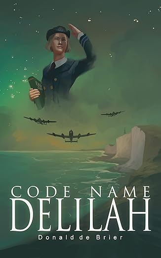
Inaccurate Tone & Mood – The current cover feels whimsical and lacks the emotional weight needed in WWII & Holocaust fiction. Readers expect solemnity, tension, or historical grit—not soft, detached illustration styles.
Weak Historical Authenticity – The character’s depiction lacks detail in uniform accuracy, facial realism, and wartime atmosphere. WWII readers often look for visual historical cues like period-correct insignia, planes, landscapes, and color tones.
Poor Emotional Engagement – Covers in this category typically evoke fear, bravery, danger, or sacrifice. This cover lacks any human emotion or urgency.
Amateur Illustration Quality – The floating, almost cartoon-like character design undercuts the seriousness of the subject matter (spy work, war, Holocaust-related themes). It visually communicates low production value.
Non-Genre Typography The serif font feels generic and lacks the gravitas typical for WWII historical novels. No typographic hierarchy or visual weight that communicates drama, espionage, or historical gravitas.
Lack of Holocaust/Espionage Cues – There’s nothing in this cover to hint at the Holocaust, wartime espionage, resistance fighters, or Nazi-era storytelling. Historical readers won’t emotionally connect or feel compelled to click on this in a crowded WWII/Holocaust category.
Professional Recommendations for Improvement:
Fix – Why
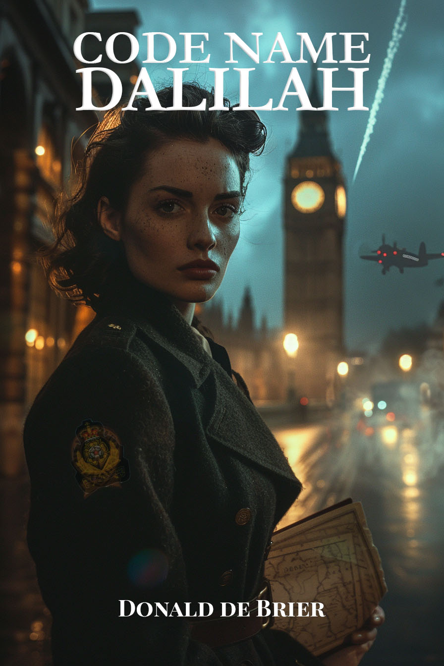
Switch to Photorealism or High-Detail Digital Art WWII & Holocaust fiction readers overwhelmingly respond to covers that feel cinematic, documentary-like, or historically authentic.
Use Darker, Somber Color Palette – Grays, sepias, muted earth tones, or stark contrasts (black/red/white) work better to signal WWII drama and danger.
Feature Strong WWII Visual Cues – Planes, Nazi insignia (if relevant), spy equipment (radios, codebooks), soldiers, maps, or barbed wire silhouettes—give readers instant context.
Apply Period-Appropriate Fonts Fonts like Cinzel Bold, Trajan Pro, Garamond Bold, or Adobe Caslon give historical gravitas. Bold, spaced lettering with worn/grunge textures helps add urgency.
Show Human Struggle – Either a close-up of the heroine looking distressed/determined, or a silhouetted figure against war-torn scenery. Emotional storytelling through imagery is key for Holocaust fiction.
Summary:
For a book placed in the World War II & Holocaust category, this cover currently fails to meet genre expectations, both emotionally and visually. It risks getting skipped by serious historical fiction readers. A redesign focused on mood, realism, and historical gravitas is essential for market success.


