
When Your Revolution Looks Like a Screensaver
We’re not sure what Rod Lingsch’s vision of a “New Golden Era” looks like, but judging by this cover, it involves patriotic stock photography, a sunset from 2003, and an overwhelming sense of… nothing.
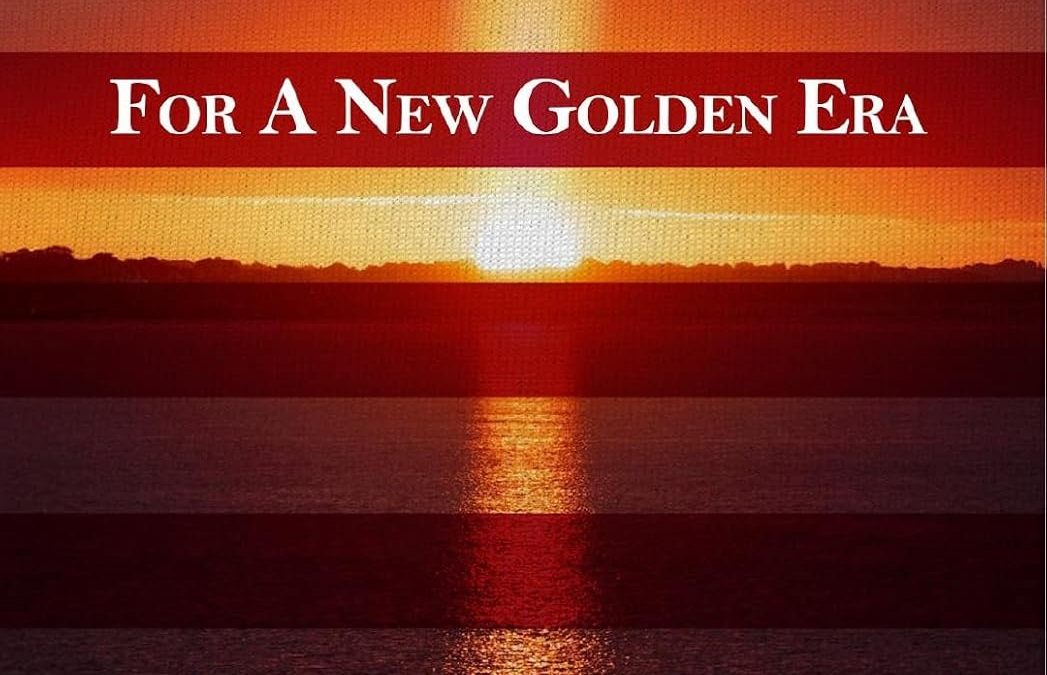
Let’s start with the obvious: the cover is a landscape photo of a sun setting (or rising?) over water, overlaid with alternating red stripes to vaguely resemble the American flag. If the Founding Fathers had access to Canva’s “flag transparency” slider, maybe we’d already be in that Golden Era.
The typeface looks like Times New Roman was asked to attend a formal event but forgot to change out of its business casual. “COMMON SENSE” screams at us in caps lock—an ironic title considering that common design sense was clearly left behind. The subtitle, For a New Golden Era, just floats beneath it like an afterthought in a Fourth of July PowerPoint.
What truly elevates this one into Horrible Covers territory is the sheer disconnect between message and image. The book promises to eliminate poverty, solve the debt crisis, replace welfare with AI, and usher in an economic revolution… yet the cover says: “Welcome to your weekend at Lake Patriotism.”
No visual cues. No narrative. No originality. Just an awkwardly aligned sunset with flag stripes and vibes that scream “slideshow background.”
We’re not saying bold economic reforms can’t be pretty. But if you’re going to rewrite the future of America, maybe don’t do it with a filter named “Warm Glow.”