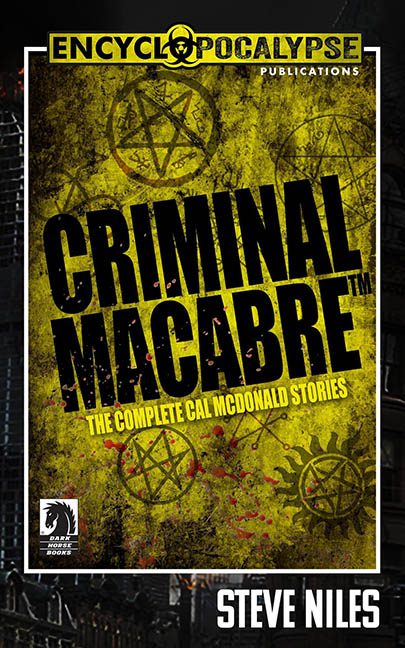
We almost let this one slide under the radar — tucked away behind layers of grunge, occult symbols, and what appears to be an oozing yellow infection spreading across the design like a biohazard-themed rash. But then we looked closer. We saw the signs. And now we’re here, with latex gloves on and our sarcasm levels turned up to eleven.
This is not a book cover. This is a graphic design hazmat situation.
“Criminal Macabre” is the title, and criminal is the correct word — because this cover feels like it committed at least three felonies against layout integrity and is currently on the run from the Design Police. Let’s begin the lineup.
Exhibit A: The Yellow Overlay from the Nether Realms
There’s a real image hiding back there. You can almost make out a gritty cityscape or the bones of something atmospheric. But instead of letting the background breathe, someone decided to suffocate it with a sickly yellow film, the color of old mustard, filtered through an ashtray. The result? Visual gag reflex.
Exhibit B: Occult Symbol Stampede
Why stop at one pentagram when you can have… all of them? They’re scattered like someone got a new Photoshop brush and couldn’t stop themselves. Some are blurry. Some are sharp. Some are glowing. All of them scream “I found this in a deviantART starter pack circa 2008.”
Exhibit C: The Font That Yelled Too Loud
The title itself, “CRIMINAL MACABRE™,” is the visual equivalent of shouting your own name in a public bathroom. It’s big, bold, distorted, and stamped dead center like a warning label. Then, for reasons unknown to man or demon, we get “THE COMPLETE CAL MCDONALD STORIES” in banana yellow — which clashes beautifully with the sewage-colored backdrop.
Exhibit D: Logo Pile-Up
The Dark Horse Books logo is just chilling in the bottom left corner like it wandered in from another cover and didn’t know where to sit. No integration, no subtlety — just, “Hi, yes, I’m also here.” And speaking of logos, let’s not ignore that biohazard-flavored header with “Encyclopocalypse” written in radioactive Helvetica. It’s so aggressively top-heavy it makes the whole cover feel like it’s tipping forward.
Exhibit E: General Design Malaise
The white border. The slightly off-center text. The fact that no element seems to acknowledge the others. It’s a cover in crisis. A patchwork of moody ideas fighting for dominance on a page that just wanted a nap.
Final Diagnosis:
This isn’t horror. This is graphic indigestion. It’s what happens when a Ouija board is used as a design tool and no one checks the layers before exporting. Criminal Macabre may be a decent read — but this cover is serving maximum sentence for design misconduct.
And frankly? It deserves every year.
