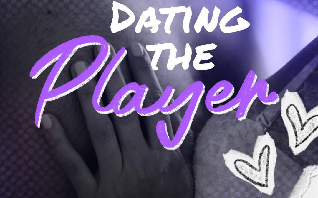

Ah yes, “Dating the Player,” a sports romance cover so confused about its own aesthetic that it could double as an SAT question on mixed metaphors. It’s The Legends Book 1, which—judging by this design—must be an epic saga chronicling the rise and fall of badly chosen Photoshop brushes.
Let’s start with the composition. We’re treated to a heavily filtered, suspiciously purple close-up of a man’s pectoral region and a woman’s hand gripping it like she’s about to knead bread dough. The romantic tension is palpable if your definition of “palpable” includes “damp locker room musk.”
Next, the text effects. The word “Player” has been scrawled in a free-script font that tries desperately to be flirty but lands somewhere between “craft fair sign” and “failed Etsy shop logo.” It’s in glowing purple, because nothing says “passionate football romance” like neon nightclub signage.
And who could ignore the clip-art garnish? We have chalkboard play diagrams, cartoon footballs, and aggressively hand-drawn hearts, all layered as if the designer was being paid by the number of stock vector elements slapped onto the page. It’s less “sports romance” and more “Lisa Frank gets really into Monday Night Football.”
The pièce de résistance? The giant football laces awkwardly intruding from the top left corner, as if they’re photobombing the couple. It’s the visual equivalent of your uncle leaning into a prom picture to ask if the punch is spiked.
This cover isn’t just bad—it’s a game plan for how to fumble both love and graphic design.