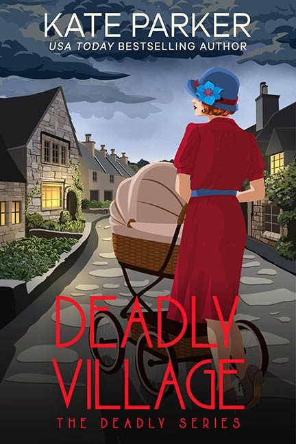
“Deadly Village”? More like Design Disaster in the Cul-de-Sac. This cover is a crime scene — not for what lies between the pages, but for what happened on the front.
Let’s start with our leading lady, who appears to be strolling through a charming English village, pushing a vintage pram and possibly contemplating her next kill — or maybe just regretting her wardrobe choices. She looks like she was imported from an entirely different art file. Her cartoonishly bright red dress and blue accessories scream “clipart cosplay,” while the background whispers “budget BBC period drama.” The lighting? Nonexistent. The shadows? Confused. The overall vibe? Someone mashed together a coloring book page and a 1998 brochure for quaint bed and breakfasts.
The perspective is a marvel in surrealism. The cobbled path narrows into a vanishing point that seems allergic to realism, while the houses on either side form a perfectly symmetrical postcard that looks suspiciously like the same three buildings copied, flipped, and prayed over. It’s less “cozy village murder mystery” and more “digital diorama for people who failed Intro to Blender.”
And then there’s the typography — or what we’re generously calling typography. The title, “DEADLY VILLAGE,” is slapped across the lower third in blood-red all-caps font that neither blends nor pops. It just sits there awkwardly, like it’s been caught reading over your shoulder. It’s trying to be ominous but ends up looking like it came from a “Halloween Party Invite Generator.” Below that, we’re treated to the thrilling redundancy of “THE DEADLY SERIES.” Because in case “Deadly Village” wasn’t enough of a hint, they had to remind you that deadliness is the brand here.
The baby carriage — possibly the most emotionally complex part of the cover — is rendered with the personality of a stock vector and the dimensionality of a pizza box. It hovers on the path with an elegance best described as “pasted-in-at-4:58PM-on-a-Friday.” It’s unclear if the baby inside is sleeping, plotting, or just embarrassed to be here.
This cover wants to be historical, mysterious, and intriguing. Instead, it lands squarely in “digital scrapbook cosplay with murder.” It’s the visual equivalent of a British detective drama performed entirely by Sims characters. If the design goal was to confuse the genre, muddle the mood, and make the protagonist look like she was teleported in from a cereal box, then bravo — mission accomplished.
Deadly? Yes. To good design sensibilities.
