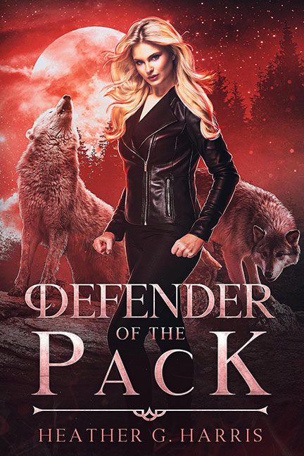
Defender of the Pack takes every supernatural romance cliché, slathers it in red dye, sprinkles it with glitter, and calls it a day. The result? A crimson mess that looks like a Twilight knockoff crashed into a cheap Valentine’s Day card.
Let’s begin with the overkill of the single-tone color filter. Someone clearly fell in love with red — and then made it personal. The result is a suffocating wash that leaves every element flattened and indistinguishable. Moon? Red. Wolves? Reddish. Background? Flaming ketchup. Even the woman’s skin has a rosy tint, like she’s been trapped in a tanning bed with no off switch. It doesn’t add atmosphere; it strips away depth, drama, and distinction.
Next up, the wolves. Two noble beasts who deserved better. These poor stock photo canines are dropped in without lighting adjustments, scale matching, or any meaningful integration. One’s howling in the wrong direction like it wandered in from a different book, while the other appears to be sniffing the model’s elbow. They’re pasted in so awkwardly, it’s like someone played “Pin the Wolf on the Book Cover” and gave up halfway.
The protagonist herself is serving mall catalog energy — all hair toss and leather jacket, standing stiff as a CGI cutout. Her clenched fist and side-eye glare suggest we’ve interrupted her mid-werewolf pose, but her placement is so artificial it looks like she’s standing in front of a cardboard backdrop. There’s no shadow grounding her to the environment. She floats in the scene like a Sims character lost in the wrong expansion pack.
And then there’s the glitter bomb — a storm of light speckles scattered across the design like someone spilled a jar of magical fairy dandruff. This isn’t mystery or magic. This is an Instagram filter with a sparkle setting stuck on MAX. Every dot screams “Photoshop brush set #27: Fantasy Glow.” It adds nothing but distraction, making an already chaotic cover feel like a cheap Lisa Frank reboot for werewolf teens.
Typography tries to hold it together, but it’s just as confused. “PACK” is spaced like it’s bracing for a crash. The author’s name stretches across the bottom like it’s trying to escape. And those symmetrical ornaments? They feel like leftover medieval clip art that wandered in from a font pack titled “Gothic-ish.”
At a glance, Defender of the Pack is clearly trying to signal: “strong heroine, fierce wolves, full moon intensity.” What we actually get is: “stock photo collage, paint-bucket filter, and magical bedazzling.”
Final Verdict:
This cover isn’t defending anything. It’s surrendering — to bad design, lazy composition, and glitter abuse. Strip the filters, ground the elements, and start fresh with a full moon and a full design reset. Right now, the only thing being protected is a bad Photoshop file.
