
If you’ve ever wondered what it would look like if a noir graphic novel, a space opera, and a blood-splattered True Crime docuseries had a chaotic love child—look no further. “Dimensional Debris” by Barbara Harrison offers us a cover that’s less “eye-catching” and more “eye-hazard.”
Let’s break it down, one layer of confusion at a time.
1. Typography: A Cautionary Tale in Two Fonts
At the top: a brush script font that would look more at home on a Dollar Tree Valentine’s card than on the front of a speculative thriller. Then, way down at the bottom—because apparently someone hit “Enter” one too many times—we find the author’s name in a typewriter font that appears to have been added in Microsoft Paint during a power outage.
Together, these fonts scream, “We didn’t know what genre this was, and we gave up.”
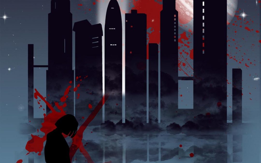
2. Color Theory? We Don’t Know Her.
The dominant palette is dark blue and red, which would be fine—if it weren’t splattered across the cover like the aftermath of a ketchup packet fight at midnight. The red is neither symbolic nor aesthetic; it’s just… there. Everywhere. Like someone tried to draw attention away from the rest of the design and failed spectacularly.
3. Silhouettes in Crisis
A lone woman stands in shadow, head bowed in tragic contemplation. Across from her: a dog, looking like it’s about to drop the most philosophical monologue of its life. Behind them? A cityscape that’s somehow both futuristic and medieval. And also mirrored. Because… reasons?
Let’s not forget the giant red X that might represent danger, a deleted draft, or the illustrator giving up halfway through.
4. That’s No Moon… Or Is It?
Hovering in the sky is what looks like Jupiter wearing a smoky eyeshadow palette. Why is it there? Is it a planet? A warning? A graphical asset purchased from a bundle labeled “cosmic and moody for $2.99”? We may never know.
5. Genre: Undefined
Horror? Urban fantasy? Sci-fi? Dystopian noir with emotional support animals? The cover offers no guidance. The only thing we can be sure of is that someone went wild with the “blood splatter” brush in Photoshop and called it a day.
Final Verdict:
“Dimensional Debris” is less a book cover and more a cautionary tale in design entropy. Every element fights for dominance in a visual battle royale—where nobody wins and the viewer is the real casualty. And much like actual debris from a dimensional rift, this cover leaves us confused, disoriented, and strangely fascinated.