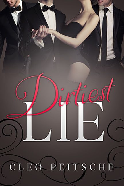
Erotic romance covers are supposed to smolder. Dirtiest Lie doesn’t smolder — it yawns in sepia tones while fumbling around with stock tuxedos and swirly fonts straight out of Microsoft Word clip-art.
Front and center we get three interchangeable men in tuxedos, their heads carefully cropped or obscured to save on stock image licensing. Their dates? Just one woman in lingerie draped across them, staring off into the distance as if she’d rather be at brunch. There’s no heat here, no chemistry — it’s “awkward prom photo where someone’s cousin was Photoshopped in.”
The composition is a mess. The figures don’t look like they belong in the same room, let alone the same love triangle. Lighting doesn’t match, shadows don’t exist, and the overall effect screams “magazine collage, but make it romance.”
Typography doesn’t save it either.
- Dirtiest is scribbled in swoopy red script — the kind of font that normally screams “Valentine’s sale, 40% off chocolates.”
- LIE is stark, blocky serif, trying to add gravitas but only creating a tonal clash.
- And the swirly black flourishes in the corners? Dollar-bin ornamentation that looks like it came free with a WordArt pack from 2006.
And let’s not ignore the palette — a drab wash of browns, grays, and muted shadows. It’s not moody or mysterious. It’s Fifty Shades of Beige.
The verdict? Dirtiest Lie wanted seductive tension, but instead it’s a sepia-toned stock photo mash-up dipped in swirly fonts and sprayed with Axe Body Spray. This isn’t dirty, it’s just dull.
