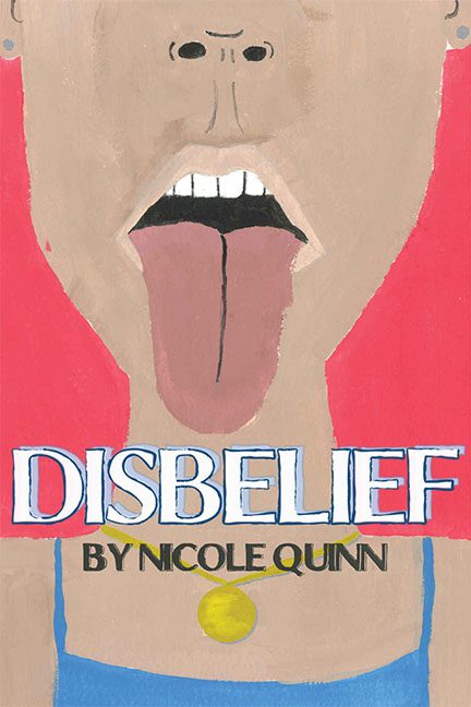
If ever there was a cover that embodied its own title, it’s Disbelief by Nicole Quinn. You don’t just see this one—you experience it, like a jump scare made of watercolor and regret. You click on it, lean in, and then immediately wish you hadn’t. Because what greets you isn’t art. It’s a tongue. A large, pink, unshaded tongue, jutting defiantly from a mouth that looks like it was rendered from memory after the artist forgot what humans look like.
Let’s start at the top—or rather, the mouth. The nose above it appears to have been penciled in as an afterthought, two tiny dots hovering uncertainly over a void of beige. The lips are just outlines, as though the artist gave up halfway through deciding whether the mouth was open or closed. And the teeth? A chunky white monolith floating in the dark, like a single Lego piece jammed into the abyss. The tongue itself is the true star here—wide, flat, streaked down the middle like it’s trying to impersonate a road leading nowhere.
Then there’s the color palette: an unholy trinity of red, beige, and blue, chosen apparently at random. The red background screams “emergency exit,” the beige skin tone leans perilously close to “cardboard smoothie,” and the blue shirt—if that’s what it is—anchors the composition with all the grace of a crayon rolling off the table.
And what’s that yellow circle near the collarbone? A pendant? A medal? The sun? It dangles just above the title like an anxious punctuation mark. Whatever it’s supposed to represent, it feels less like jewelry and more like a warning label.
Now to the typography—oh, the typography. The title DISBELIEF sits dead center in a chunky white typeface outlined in electric blue, trying desperately to assert itself amid the chaos. It looks like the kind of font you’d find on a 1980s roller rink poster, not a literary work. Below it, BY NICOLE QUINN is written in a mismatched font that hovers awkwardly on the chest area, as though trying to hide from the rest of the composition. It’s like even the text wants to distance itself from whatever’s happening above.
The composition is both minimal and chaotic—minimal in detail, chaotic in concept. There’s no sense of balance or design flow. It’s as if someone took a finger painting, added MS Paint text, and declared, “Perfect! Ship it!” The end result is a piece that makes you question not just artistic choices, but human decision-making in general.
And yet… there’s a strange honesty in how Disbelief presents itself. It doesn’t try to hide its flaws—it flaunts them. It’s a cover so unpolished, so visually aggressive, that it loops back around into performance art. It’s not just amateurish—it’s a study in how far you can push simplicity before it collapses into confusion.
The most generous interpretation is that this cover is an abstract commentary on the very concept of disbelief: disbelief that this was approved, disbelief that someone uploaded it, disbelief that this is now burned into your retinas forever.
In the end, Disbelief achieves something few covers do—it unites us all in a shared emotional response of shock, bewilderment, and, yes… disbelief.
