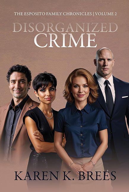
With a title like Disorganized Crime, you expect mob intrigue, shadowy back alleys, and maybe a splash of danger. Instead, this cover delivers what looks like the cast photo for a canceled network drama about HR compliance training.
Let’s start with the “family.” These four characters are lined up like they’re posing for a Sears portrait session, not a gritty crime saga. Everyone has that waxy, AI-smoothed mannequin glow that makes them look more animated than alive. Instead of mobsters, they look like an awkward office softball team that didn’t win a single game.
And then there’s the aspect ratio disaster. On the far right we have Mr. Bald Enforcer, except he looks less like a threatening muscle man and more like he’s standing on a tiny step stool behind the others. His head and shoulders are comically oversized compared to everyone else, making him look like an action figure someone Photoshopped in at the wrong scale. Either he’s 7’4” or the design team has no idea how perspective works.
The background is just as thrilling: a beige blur. No shadows. No texture. No hint of menace. It’s basically the backdrop for a LinkedIn headshot session. For a book about crime, this is criminally boring.
And the typography? “DISORGANIZED CRIME” floats blandly in a thin serif font with a silvery wash that blends into the background like it’s ashamed to be here. It doesn’t scream tension or danger. It whispers annual corporate report. Meanwhile, the author’s name at the bottom is huge, but equally uninspired — just another block of text in a sea of beige.
The verdict? Disorganized Crime should have been a knockout concept, but the cover looks like a business casual family portrait gone wrong. With its mannequin characters, wrong-scale mobster on a stool, and zero sense of atmosphere, this one should be sentenced to design jail without parole.

