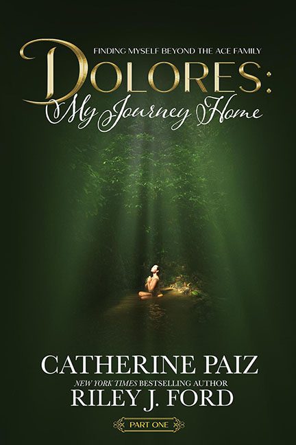
“Finding Myself Beyond the Ace Family” may be the subtitle, but someone needs to find the design sense beyond this swampy mess of a cover. Buckle up — we’re diving into the murky, green-tinged bog that is Dolores: My Journey Home, a cover that screams deep personal growth… if that growth took place in a discount Photoshop class held in a forest cave.
Let’s start with the obvious: forest sludge green. This is the main color choice, the visual mood setter, and it looks like something that was scraped off a fantasy novel from 1998 — the kind sold at garage sales next to cracked VHS tapes. But instead of dragons or spells, we get a small, oddly-lit woman meditating in the middle of a glowing puddle. She’s clearly not part of the scene. She’s been dropped in. The lighting doesn’t match, the scale is questionable (Is she tiny? Is that forest huge?), and there’s a suspicious mystical glow that feels less “spiritual awakening” and more “Photoshop Lens Flare #4”.
Next: the fonts. Oh no. Oh no no no. This cover walked into the Font Buffet and said, “Yes, I’ll have one of everything.”
-
Dolores is rendered in a shiny serif that belongs on a perfume ad.
-
My Journey Home swirls in a script font so delicate it’s nearly invisible against the leafy green soup.
-
Then we get the full courtroom drama all-caps treatment for the author names, as if this book is testifying under oath.
-
And finally, a little gold ribbon declaring Part One, because why not toss in a medieval bookmark while we’re at it?
Now let’s talk composition. Or rather, the complete lack thereof. The focal point — if you can call it that — is a lonely figure floating dead-center in a sea of swamp glow, as if she’s about to be abducted by bio-luminescent bacteria. There’s no visual hierarchy. Your eye doesn’t know where to go — do you look at the title, the subtitle, the meditating woman, or the strange forest vortex?
The real mystery isn’t the secret within Dolores’s soul — it’s how this design got past the first draft. Memoirs typically go for emotional resonance, clarity, and authenticity. This one went for “Narnia meets a self-help pamphlet designed in the dark.”
Final note: If you’re trying to invite readers into your deeply personal journey of identity and transformation, maybe don’t make it look like you were raised by sentient moss in the haunted part of FernGully.
This cover isn’t spiritual — it’s just spiritually lost.
