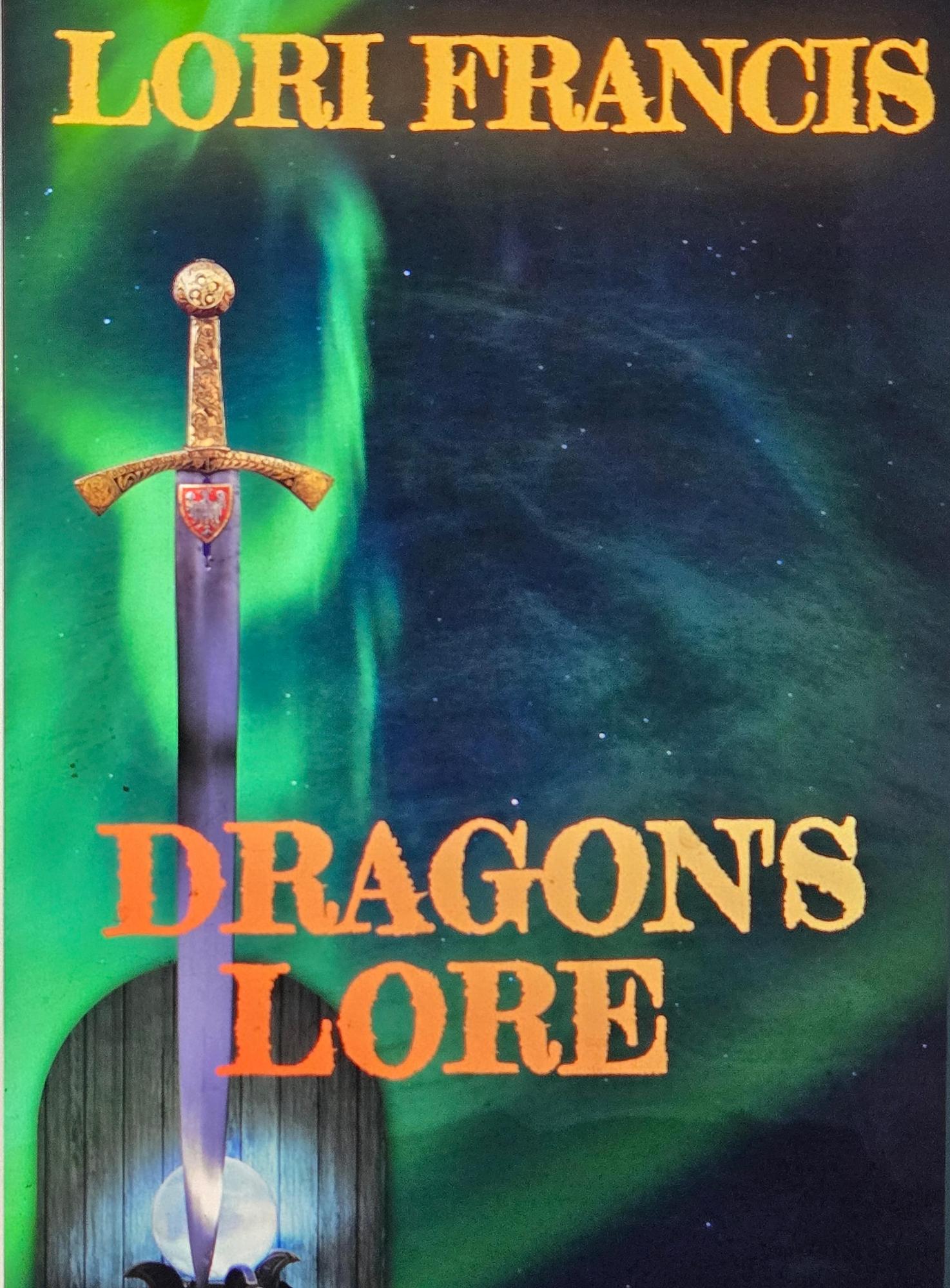
Oh, Dragon’s Lore. A title that promises adventure, magic, and fire-breathing spectacle — and yet, delivers a cover that feels more like the end boss was “MS Paint circa 2002.”
Let’s start with the sword, which appears to have been plucked from a free Photoshop brush pack called Totally Not Copyrighted Fantasy Weapons Vol. 3. It’s rammed into a medieval shield/door hybrid that looks like it belongs in a rustic tavern, not in front of the Northern Lights™ clip art stock photo. And this aurora isn’t even majestic — it’s pixelated like a screensaver from the days when people still said “surfing the web.”
The typeface? A burnt-orange, faux-weathered display font that looks like it’s been dragged through a wood chipper, then soaked in Tang. It’s screaming for attention while simultaneously clashing so violently with the green background, I’m surprised the color wheel hasn’t filed a restraining order.
Composition-wise, the sword is perfectly centered, splitting the page vertically — a bold choice if your goal was to make the text feel like it’s being shanked by the weapon itself. The title’s kerning is inconsistent enough to make typography nerds weep openly, and the placement makes it feel like “Dragon’s” is the name of a small-town diner and “Lore” is today’s lunch special.
And can we talk about the vibe? This isn’t the cover of a fantasy saga — it’s the cover of a self-published “renaissance fair program” someone printed at Office Depot after the manager said they had to use up all the leftover yellow toner.
Verdict: The only “lore” here is the whispered cautionary tale of what happens when you design a book cover entirely with clip art, free fonts, and the color palette of a 1970s shag carpet.

