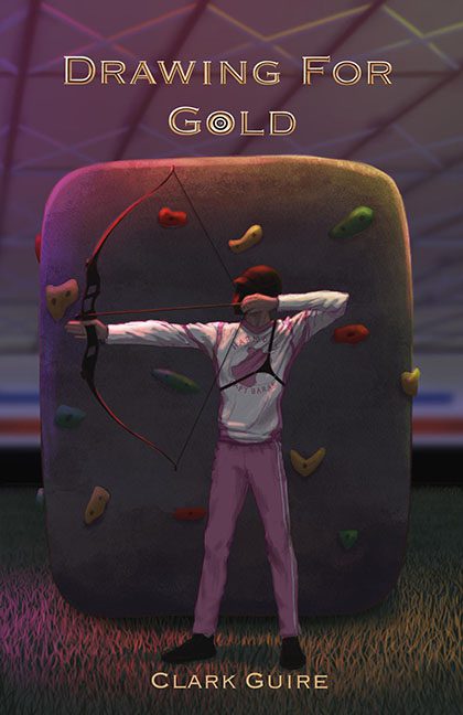
If this is drawing for gold, I can only assume the competition was judged by blindfolded squirrels. Welcome to a cover that takes aim — and misses the target, the point, and possibly the genre.
Let’s start with the obvious. Our heroic archer stands confidently before what appears to be a bouldering wall — because nothing says Olympic archery like shooting arrows at a playground rock. It’s a visual contradiction wrapped in a climbing gym fever dream. And the perspective? Nonexistent. The archer is floating somewhere in the uncanny valley, casting no believable shadow and existing in a space where physics, logic, and basic design principles do not apply.
Speaking of our archer, who rendered this figure — a medieval AI art filter set to “generic athlete”? With flattened limbs, emotionless posture, and smudged shading, this poor soul looks like they were dropped out of a knock-off video game cutscene and onto this cover in shame.
Then there’s the title: Drawing for Gold. Which kind of drawing are we talking about? Illustration? A raffle? Because there’s zero gold, and a whole lot of visual confusion. And “Gold” is styled with an O that looks like it’s trying to moonlight as a target, but ends up more like the bullseye of embarrassment.
The lighting is a spectacle of nonsense. We’ve got neon bowling alley vibes on the ceiling, dead shadows on the floor, and no cohesive light source. It’s like the cover was set at midnight under a disco ball held hostage by indecisive art direction.
And that font? A limp attempt at elegance that ends up whispering, “I was installed by default.” Nothing about it says competition, drama, or skill. Instead, it feels like the placeholder font that accidentally made it to the printer.
In short, Drawing for Gold feels less like a winning shot and more like a dart thrown by someone spinning in a circle. If cover art were an Olympic event, this one wouldn’t place. It would be disqualified for creative doping.
Better luck next draft.
