
Here is our suggested dramatic fix

For a sci-fi novel centered on dystopian survival, eco-rebirth, and unraveling dark secrets beneath a utopian façade, the cover for Eden Reforged unfortunately misses the mark both visually and thematically.
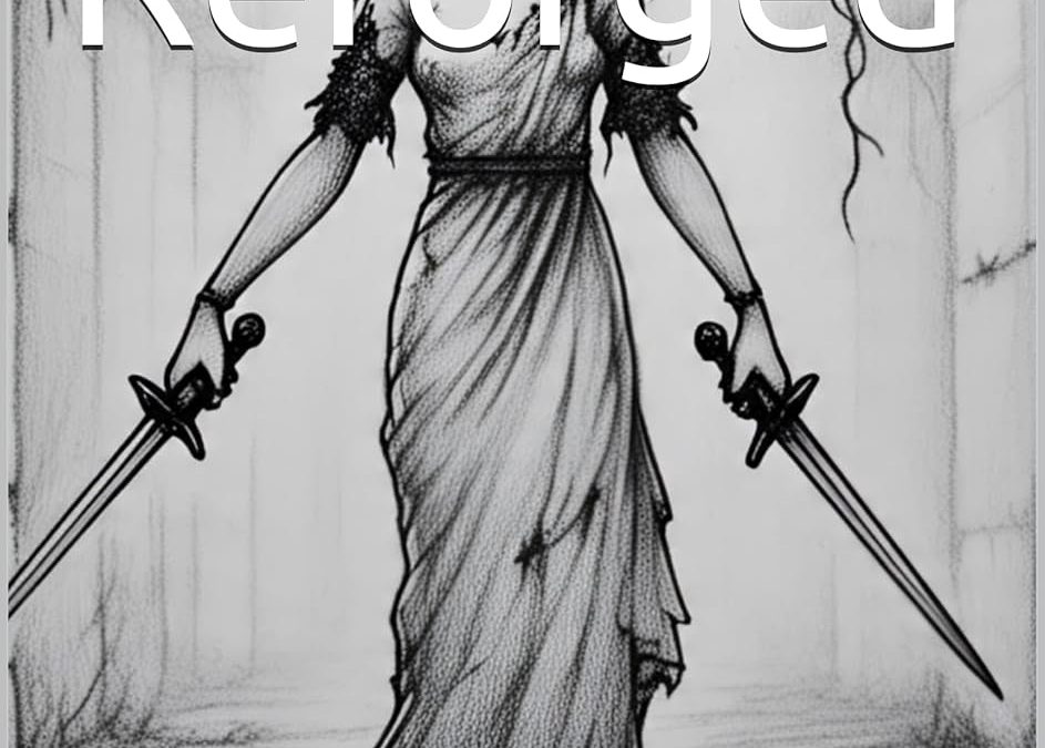
The first and most glaring issue is the illustration style. The pencil-sketch, black-and-white aesthetic feels more suited to a YA gothic fantasy, dark fairy tale, or even an indie horror zine. There’s no visual connection to science fiction, eco-dystopia, or technological themes. The linework is rough and lacks professional refinement, making the cover feel amateurish.
The central character design—a young girl in an old-fashioned dress holding two short swords—immediately signals the wrong genre. Nothing about the visual suggests futuristic technology, lush eco-rebirth, or dystopian tension. Instead, it evokes Victorian gothic or sword-based fantasy, which would confuse a sci-fi reader at first glance.
Typography is another critical problem. The font choice is generic, likely a default system sans-serif, and lacks any design treatment. There’s no thought given to spacing, placement, or stylistic hierarchy. The white text is simply overlaid with no shadow, stroke, or texture to create separation from the background. At thumbnail size, the title and author name would likely blur into the background and become unreadable.
The lack of color compounds these issues. For a book involving vibrant eco-restoration, technological wonders, and the duality of beauty hiding corruption, a monochrome sketch drains all potential energy from the concept.
Finally, there’s no genre signaling. Readers looking for sci-fi dystopian thrillers expect covers with atmospheric lighting, color contrasts (often blues, greens, or metallics for sci-fi), futuristic typography, and visual cues like cityscapes, technology, or environmental collapse/renewal.
Conclusion:
The current cover for Eden Reforged is a genre mismatch, lacking professionalism and market viability. It sends entirely the wrong message for the target sci-fi audience and risks turning away readers who otherwise might be interested in the story.
A complete cover redesign—one that embraces the book’s sci-fi dystopian themes, eco-rebirth aesthetic, and underlying suspense—would dramatically improve its shelf appeal and sales potential.
Our Rework
This reworked cover communicates genre, mood, and narrative tone. The dystopian cityscape overgrown with vegetation, combined with the atmospheric green haze and digital light particles, instantly signals eco-dystopia with sci-fi elements.
The silhouetted female figure in the foreground creates mystery and positions the protagonist as an explorer or reluctant hero—perfect for readers of post-apocalyptic, dystopian, and environmental thrillers.
The colour palette (greens, dark grays, light mist tones) now fits industry standards for this genre—echoing the look of titles by major sci-fi authors and traditionally published dystopian books.
The typography is also improved. The futuristic sans-serif font for both the title and author name fits the sci-fi aesthetic much better than the previous generic typeface. The spacing and placement are clean, and the light title color stands out well against the darker background.