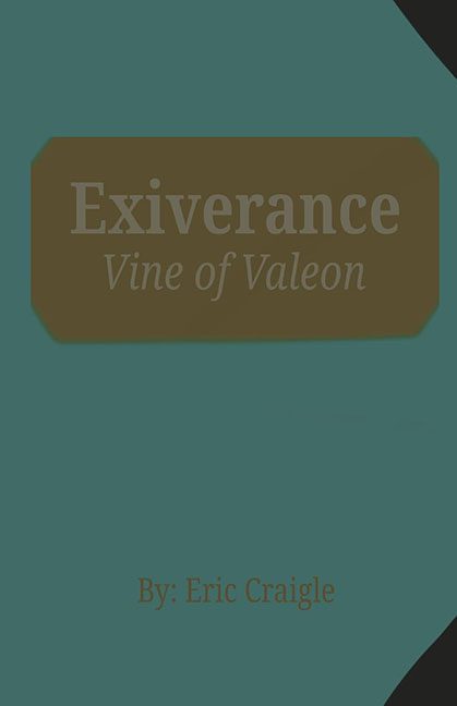
Every once in a while, a cover crosses our desk that makes us stop, squint, and ask: Is this the final version… or did someone accidentally upload the placeholder file?
Ladies and gentlemen, I give you Exiverance: Vine of Valeon, which looks less like a fantasy novel and more like a half-baked PowerPoint title slide for a business presentation.
The Color Problem
That muddy teal background? It’s less “mystical vine fantasy world” and more “1997 office wallpaper.” And the strange brown octagonal blob slapped in the middle feels like someone pasted over a mistake instead of designing something purposeful.
The Typography Tragedy
The title is not only hard to read, it’s practically camouflaged. The low-contrast lettering makes your eyes work harder than they should, and not in a good “mystery and intrigue” way. More like: “Wait, is that an E or an F?”
And the byline? Tacked onto the bottom like an afterthought. “By: Eric Craigle” — because apparently the “By:” was necessary in case we forgot how author names work.
Where’s the Fantasy?
Covers are supposed to sell the book, giving potential readers a peek into its world. Instead, this cover communicates exactly nothing. No magic, no vines, no Valeon, no adventure. Just… teal. A whole lot of teal.
The Final Verdict
This isn’t a finished book cover. It’s the design equivalent of showing up to a costume party in sweatpants and saying, “I’m dressed as someone who didn’t try.”
Eric, your story might be great — but this cover guarantees nobody will ever find out.
