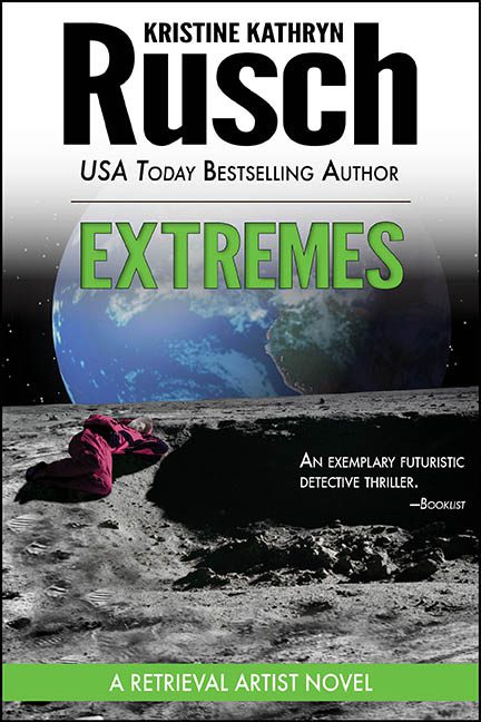
This cover is called Extremes, and frankly, that’s appropriate—because we’ve just witnessed an extreme lapse in design judgment. Strap in, because this sci-fi crime scene is crashing harder than Windows 95 on a dial-up connection.
Let’s start at the top, literally, with the author name “Rusch” taking up one-third of the real estate like it’s the headliner at a techno festival. The typography is bold, black, and completely disconnected from the rest of the aesthetic. Below that, we’re told this is from a “USA Today Bestselling Author,” which feels about as organically placed as a “made with stevia” sticker on a bag of beef jerky.
And then there’s “EXTREMES” — screaming at us in a radioactive green gradient like a highlighter had a midlife crisis. The font is bold, blocky, and completely at odds with the lifeless, overcast moon-murder happening just below. It’s like someone ran out of ideas and went with the first WordArt effect they found under “aggressively generic.”
Now, to the main event: a woman in a magenta bathrobe has apparently taken a fatal nap on the moon. We’re guessing she’s the victim in this “futuristic detective thriller,” but the real mystery is how she ended up looking like she’s cosplaying as a lunar throw pillow. The lighting? Nonexistent. The shadows? Comically wrong. She appears to have been dropped in at the last minute, like someone accidentally dragged a photo into their Photoshop file and thought, “eh, good enough.”
Behind her, Earth hovers in the sky like a low-res globe from a third-grade geography project. It’s so heavily blurred and filtered it looks less like a planet and more like a Jell-O mold in space. The entire image is a Frankenstein’s monster of mismatched layers—none of which acknowledge that light, perspective, or dignity exist.
And just when you think the chaos is complete, your eye is assaulted by the green bar at the bottom announcing: “A Retrieval Artist Novel.” That bar looks like it was added in PowerPoint five minutes before the file went to print. It doesn’t belong. It doesn’t blend. It’s just there. Floating. Like the designer’s last hope.
Even the blurb from Booklist can’t save this: “An exemplary futuristic detective thriller.” Really? From this cover, the only thing being retrieved is my will to care. And maybe the body.
The saddest part? This book might actually be good. Kristine Kathryn Rusch is no amateur writer. But this cover makes her look like she outsourced the design to someone who just discovered layering last week and thought “space = cool = black + green + crime scene.”
This isn’t sci-fi noir. This is space-themed clip art that slipped on a banana peel of graphic design and landed face-down in a crater of mediocrity.
In short? Extremes is a visual crime, and the only thing that needs retrieving is a better cover.
